Thursday Report: Thousands, and Thousands
It’s been a big few weeks for The Garden Path — after closing in on some January crunch, the game was featured on this year’s digital Godotcon, showcasing unedited footage of the game’s first ten minutes as they are now.
My hope was to have the game in a state where I wouldn’t need to manipulate the game or footage in anyway. When preparing footage like this it’s possible to ‘script’ seemingly random events to make the game seem like it’s operating normally, when is infact on-rails and not actually playable in that state.
Other than forcing acorns into Thom’s inventory for the sake of demonstration, there was no other manipulation on the game’s random elements (which mostly boils down to character spawn, character movement, and map generation). And the only superficial system was when I invite Olga to the garden – the resident system is 90% there, but wasn’t necessary for the sake of the presentation.
So all in all a very faithful playthrough, I believe. Reception was warm too. I had been anxious that the presentation might be a bit slow or a bit boring, but I think generally the artwork and tone helped break the slower moments. It is a slow game, after all.
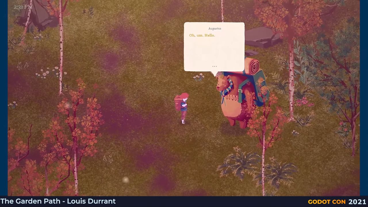
Most concerns seemed to arise from the size of the text of the characters, which is funny because it’s something I always felt was possibly too large. It’s a comment I’ll take with a grain of salt, since I imagine most viewers weren’t watching in fullscreen, as the game would be played. Instead, the video probably appeared in a smaller box in their browser. Something I ought to have planned for when preparing the footage.
Being able to change the size of the text wouldn’t be too hard to implement, although it’s place on the roadmap will probably be determined from playtesting.
Thanks to everyone who tuned in, it was a moment of great encouragement and continues to be. If you missed the presentation, it’s still available via this timestamped link.
I found myself pretty burnt out after delivering the footage, so took a well-needed break that would allow me to come back to the game with a fresh head.
When my head hit the pillow on the night I finished up the Godotcon footage, just moments after hitting the ‘send’ button on the email, my mind went spinning about a new system for character movement and object spawning. So I had this mulling over in the meantime.
Afterall, characters spawning in strange places and walking into walls was still causing me grief, and while the previous system of wayfinding (discussed in earlier blogs) works most of the time, it’s simply too obvious and too shattering when it doesn’t.
I thought then, why not have a constantly monitoring reference for where collisions are and aren’t? It needn’t be perfect or entirely up to date, as the existing systems would make for good fallbacks.
I began planning out a way that there would be tens of thousands of nodes all reporting back to a central system whether or not they were ‘safe’ or not.
It quickly dawned on me that haven’t all these nodes reporting collision was incredibly resource hungry, so I instead built it around a ‘sweeper’, a single area that scans from left to right across the map and makes note of what areas are safe and which aren’t.
The problem with that? It’s slow. It takes a certain amount of time to detect collisions, and despite being a fraction of a second, when accounting for thousands of distinct points on the map, that time adds up.
Instead then, multiple sweepers speed up the process exponentially without being too resource hungry. Sweepers detect which points haven’t been updated, assign themselves to that point and update them.
The result is oddly satisfying, painting a large map of where clearings are available. As the sweepers are the only ’nodes’, the rest is just data, which means it’s lightning fast. While previously routes could be built about twice as fast as the character walking, a route can now be planned in a split second, and with far fewer resources.
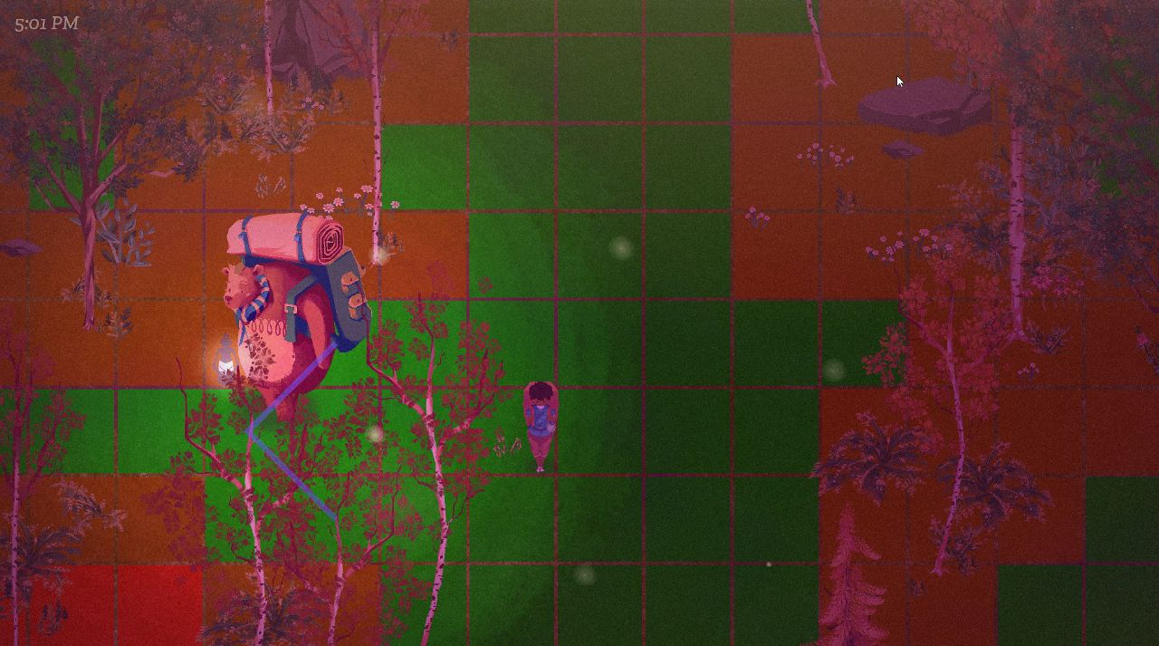
The potentially far greater use for this however is the reporting back of areas of a certain size. Malakai, the mysterious figure sat by the fire, is a good example of someone that would make good use of this. Malakai always appears by a fire, and so will always need a clearing of land to spawn into. It’s now just a case of asking the game to return back a ‘zone’ of a size that will fit Malakai and his fire, and he can do so without the worry about spawning on top of a tree or similar.
Items and characters added to to the world map can ping the sweeper to alert that the map has changed, and will need updating, then the sweeper can get to work and sweep the surrounding areas.
It’s a system that’s already paying off in big ways, and I’m hoping it will be the peace of mind I’ve been after.
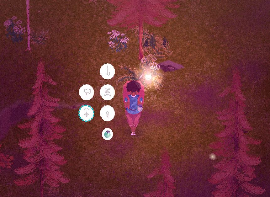
In smaller news, the equipment menu has entered its third and (hopefully) final redesign.
Its first design saw each item fan around the player’s character, in-lieu of a ‘radial’ menu.
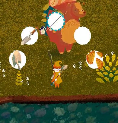
I needed to change it up since, during testing, it gave the wrong impression that the menu could be navigated by spinning the control stick to the angle of the item. I probably envisioned this when I originally plotted out the design, but a core part of game’s controls is the separation of movement and UI — movement on the stick, and UI on the DPad. This way certain menus can be operated with movement of the player’s character still available.
I eventually adapted the design for the items to instead hover nearby the items on the player’s backpack. I really liked the visuals of this, and while it looked neat in screenshots it was a logistical nightmare to implement, and was terrible to navigate.
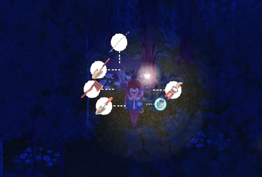
The implementation lead to dozens of different nodes each tracking the locations and offsets of the items, with realtime calculations figuring out their relational distances to one another, and the player, and the camera. Top that off with the fact that the player’s items can appear in four different configurations – front, back, left and right – and the result was a complete mess along all stages of its development.
The design also meant that each item could potentially be in a number of different locations, so you couldn’t always rely on muscle memory when selecting between them.
And so, in this third iteration, the items are simply presented in a vertical grid to the left of the character. It’s reliable, functional, and I personally think it’s the most appealing looking of the three too.
It feels great having this system finally streamlined, something I can set and forget. It does what it needs to, and nothing more.
Lastly, in terms of focus, with the tutorial largely blocked out and the event system functioning, what’s left is just bringing the save system up to speed with the new scale of the game and everything that’s been introduced.
Previously I had been dealing with saves of a few hundred props, but the game needs to reliably handle many thousands.
As anticipated, the game locks up when loading in all the spawn points due to the sheer number. I’ve become pretty accustomed to building a queue system to help pipe through heavy loads at a steadier rate, but maybe it’s no surprise that lining up thousands of props takes a good deal of time when going through them one at a time.
Instead, the spawn points are grouped into ‘parcels’ before loading into the tree, then those parcels are queued up and loaded one after the other instead. This speeds the process up by many factors, while also not cramming everything through the pipeline at once. A decent middle ground.
Given that the game has no loading screens once in-game, a slightly longer initial loading screen is a decent trade off. But, for now, you’re able to jump into the game from where you left off in under a couple minutes, and I don’t see it getting any worse from here on out.