official devlog for
carrotcake
written by Louis Durrant
On Delays (and the days inbetween)
Firstly - welcome back to the blog! After being down for some time, it was a little task to dig up the old gifs and images and sort everything back neatly onto their shelves. I’m hoping it’s all back to how it was, and that I’ve not missed anything.
There’s a wealth of old development logs here dating back to 2018, and it’s been a trip down memory lane revisiting it all in that process.
I put the blog to rest in 2021 in favour of the community newsletters we’ve been sending out - a much more digestible format for those looking forward to feature updates, and aren’t so fussed about the under-the-hood (don’t worry - those aren’t going anywhere!). That year I had a feeling that I had something that was a bit more of a personal project. I had my hopes on a small but meaningful launch on itch.io that autumn. I wanted to reach out to publishers and PR teams for the first time to see if I could broaden The Garden Path’s reach.
After a successful Kickstarter there was a rush of feedback. It became clear that some game-design ideas that I had bubbling in my head (many of which I’ve discussed in this blog) weren’t adding up to as fun an experience as it could have been. The old bartering system, for instance, where you were bombarded with a dozen different coloured lines the game expected you to decipher, or how it felt impossible to target that one node of bracken in a dense patch of forest.
2022 was then spent working on that feedback, and the game went through some significant changes, some subtle and some less so subtle. Sometimes it’s easy to forget what’s changed without going back to see how things were a year or so ago! I keep meaning to compile that list.
So - we had our eyes set on Spring/Summer 2023. The 1.0 roadmap was drawn and I think I had a decent little build to work toward. Those in the industry will know - even once you have a finished game, there’s a fairly long process to getting it in the hands of the people who want to play - and you’re not always at the front of that queue! I slipped on a couple features - we had the game on Switch and working multiplayer, but it was where those two features met that took the most time.
More recently, I made a difficult judgement call that performance on Switch just wasn’t where I wanted it to be. Since the start of 2023 I’ve made huge progress in Switch performance and load times, but there came a point where the returns were diminishing, and weren’t able to get me beyond the final hurdle. The Switch is an important platform for The Garden Path, and so I’m eager to get it right, and not release something that feels like a lazy port in the shadow of its PC version.
With the busy holiday season ahead of us, it made sense to step back and look to 2024 instead. With that additional time I’ve been adding a few more features that I’d really hoped to see in 1.0, as well as a wealth of optimizations that both PC and Switch players will benefit from. I’ve also been experimenting with the latest versions of Godot, which has shown some really promising benchmarks, and I’ll be looking forward to playtesting results in the coming weeks.
Often when a game sees delays it’s echoed ‘A delayed game is eventually good, a rushed game is bad forever’ - to the point of it being a little cliche. We’ve seen many games over the years release in a thin state, only to see success after many updates and patches, and delayed games aren’t always delayed for the sake of ‘good’.
The point being - I understand that, and I want to put this delay to good use, and to good reason. It means the world to me to read messages from folks telling me it’s okay to take time, and make something worthwhile. That said, I also understand I’m asking for more patience from people who have already shown me so much support for so long.
I think this blog is a key part of this six year journey, and that’s why I felt it important to brush the dust off. I don’t know if 1.0 will be the end of that journey or the start of something new, and, after all - I’m still finding it. It certainly feels closer than ever.
So I’m hoping to use this space to cover some of the work I’ve done and have been doing in a little more depth, particularly for those interested in the knitty-gritty of the work I do each day. I’ve learnt what feels like a million lessons since starting this blog, and I’d like to talk about at least a few of them here.
It’s going to be some busy months ahead. I hope everyone enjoys the holidays! I’m certain 2024 will be here before we know it.
Follow me on Twitter, or maybe even Mastodon.
>> Link to post.Thursday Report: Quality Of
It’s been a short while since our last report, but it’s certainly been one of the busiest and most productive months the game has seen.
Let’s begin with a small semi-announcement on the game’s release. While never concrete, there’s been some recent developments that have likely meant the game’s official release might be pushed back – hopefully no more than six months. I can’t express how much I value those who have been with me the whole way, anticipating the game for the last three years, and it’s disheartening to know the wait will likely be that much longer.
I can’t say much more right now, but what I will say is that these developments will (should they go ahead), without question, result in The Garden Path being a better game for it.
There will be more information on this in about a month’s time.
In somewhat-related news, The Garden Path is slowly easing back into testing — let’s go through just some of the things I’ve been working on since the last report.
I’m generally happy with the performance of The Garden Path – there’s a number of now quite sophisticated (at least by my standards) series of systems that help define the game’s large map, especially compared to a year ago when the game stuttered and dragged. Now it maintains a clean 60fps on my mid range 2017 system, only dropping some frames here and there when moving, which are mostly disk-read related.
It occurred to me that when there’s a great deal of repeating assets throughout the game that it was a waste of resources loading everything in and out as the player moves through the map.
I realized that I could instead swap items that were out of sight into the place of a prop about to come into sight, if they were the same prop, and quickly adjust its settings to match the nuisances of the new prop.
This essentially works by having each prop declare themselves available to be swapped before unloading. They then wait 5 seconds, and if another prop matches with the prop unloading before those five seconds, the old prop will be transferred over – no loading or unloading.
The result is a far smoother experience moving through the world with much less noticeable frame drops, as a great deal of loading is skipped as things just rearrange themselves seamlessly. Not all of the props are swapping out, but a good deal of them are.
I’ve ran into a problem however where memory usage creeps up and up and up while playing the game this way. It’s frustrating because I can’t quite pin down the exact cause. It’s surely because certain props that should unload aren’t unloading, but where exactly that hiccup is in my code I can’t quite figure out.
The game is still smooth without it, certainly playable, but it’s a noticeable improvement I’m hoping will make it officially into the game soon.
My primary focus at the moment is the experience of returning to the game, as well as focusing the player toward goals and immediate gameplay targets.
Looking forward to the next day, or returning to the next day excited to see what the game has in store is an absolutely integral feeling that I want to capture in The Garden Path.
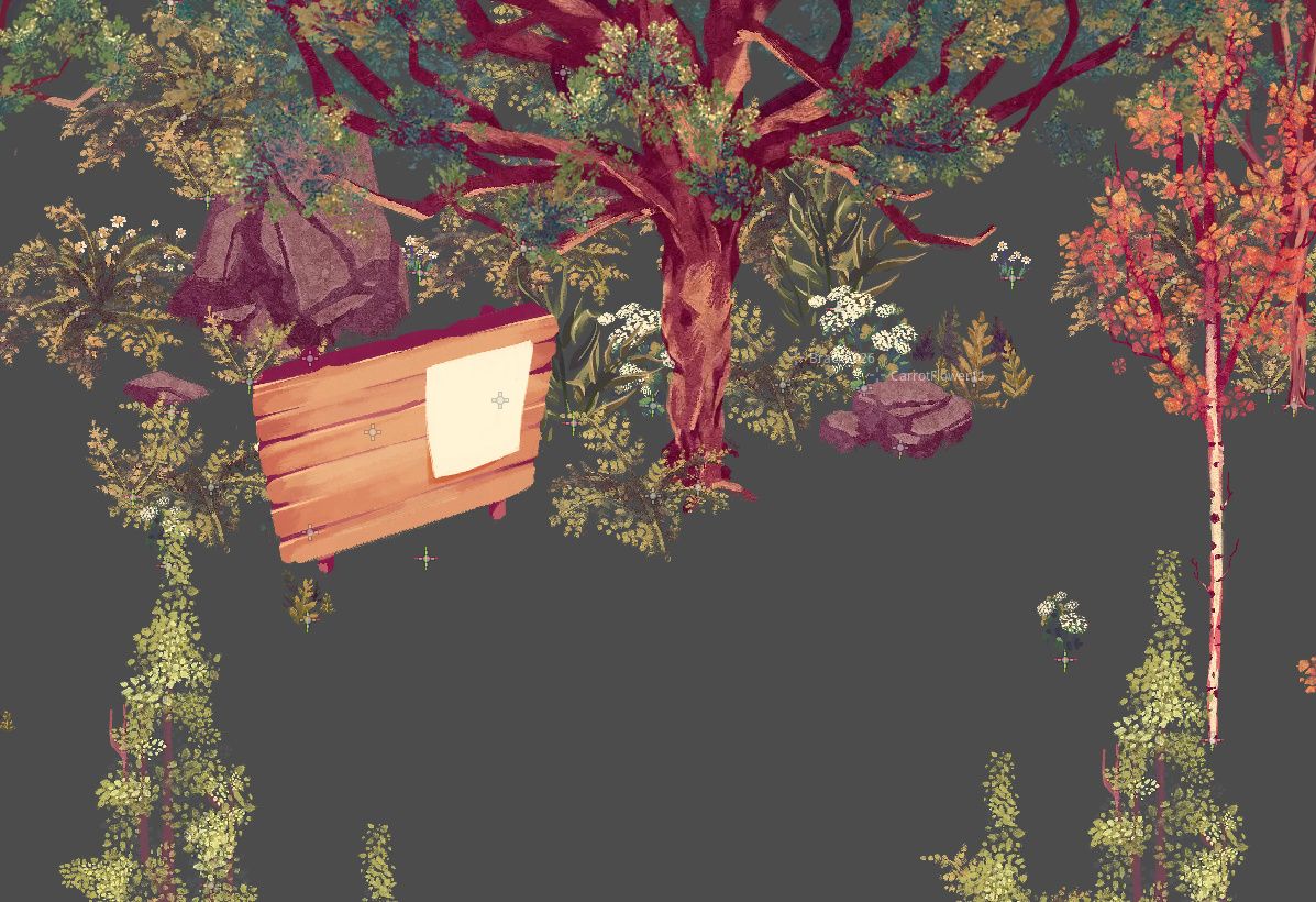
I currently have the bulletin board that the character will be able to go up to and interact with to see the latest news in the garden. This is okay, but the map is fairly large and it can take time to reach if the player is far away enough — they may even forget about it entirely.
As such something the presents itself at the start of a new day would likely be more appropriate. At the same time though, I’m eager for the game to feel as snappy and as quick to jump into as possible, and any hoop I add to the return experience should be taken seriously.
Animal Crossing has Isabelle report to you every time you return to the game on a new day, but it’s a long cumbersome dialogue tree where 90% of the time she reports that there’s nothing to report. It’s possible this screens a longer load time, but I would rather at least have the option to divert my attention elsewhere.
My plan then is to have a short 2-3 second animation of a dove delivering a telegram to the player on daybreak or new-day-load. The ’telegram’ provides the same information as the bulletin board – which NPCs have declared their presence for the day, the weather, events, and so on.

Does this render the bulletin board useless? Maybe.
The bulletin board has other purposes, so it makes sense not to ditch it, but having it’s primary focus be rendered useless should probably be designed around.
I might have it so the message can only be read the once. It could be that the message is a shortened version suggesting the player see the board for more details.
Hopefully I’ll land on something soon.
I also had the idea of a ‘morning brew’ system, whereby you could set aside a cup of tea the day or days before, and upon a new day you can drink the tea with increased effects.
Just an idea at this stage, but I like that it encourages some forward planning, and sets the player up for the next day, rewarding them for doing so.
I can’t think of an elegant way for the player to submit that item into the system, so it’ll be a little longer before I plan it out concretely.
I’ve introduced a few small features that help aid player knowledge.
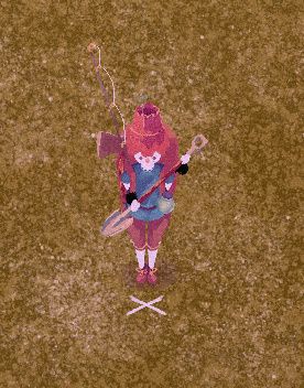
The trowel and shovel now have an X to mark the player’s aim. The X also hides itself if the player isn’t able to dig. Before it was a little hard to determine where the hole was going to go, especially from different angles.
Previously trees only had their foliage go transparent when a player or NPCs moved behind them, but now the trunk fades out too – this makes moving around the 2D world a vast deal easier, when trunks were the main visual obstruction.
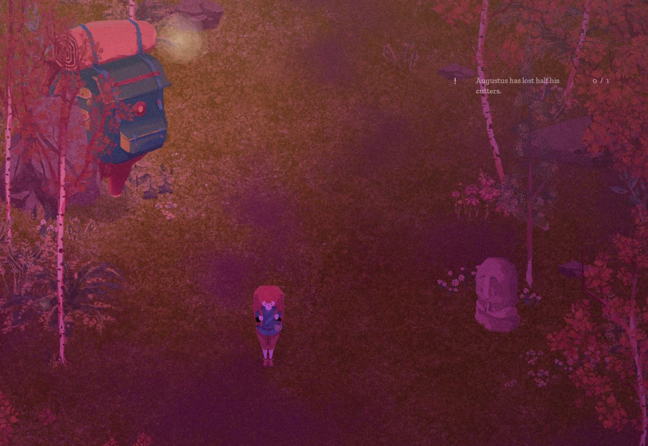
A new errand tracker appears on the right side of the screen, just as it might do in an RPG, providing a handy reference on how far along you are on each errand. This also works with stars, allowing you select a number of stars to include on the tracker to track your progress to unlocking them. I’ll likely allow this to be turned off for those who want a cleaner look to the game – the same information is available in the overview menu.
The focus aim system, which allows you to use a crosshair to better select a prop in the world, now also returns useful information of the prop highlighted by the prop returning a package of information to the aimer. Still in early stages, but this could display all kinds of otherwise hidden information to the player, perhaps most usefully it’s age, name, and how long until it grows into its next phase.
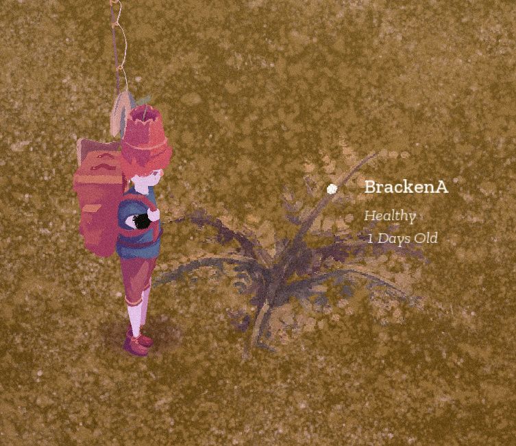
I want the game to feel like it’s not deliberately making things hard for the player, and every little helps to smooth out the gameplay experience.
I’ve begun more concretely entering the data for each item that will appear in the game. It’s a gruelling task, especially with 250+ items already in the game and many, many more to come. I imagine the kind of task that’s easier to do as you go along than in one big lump.
All the different items have an array of different information they need to hold. The trading system relies on a hidden inherent value, for instance, and every single herb and spice needs to carry it’s own effects for when brewed into tea, and every piece of equipment needs it’s own stats and description.
Once a good body of items are in the game and the return-to-game experience is ironed out, I reckon I’ll be ready to starting labelled the game as ‘beta’.
Until then…
Follow me on Twitter, or maybe even Mastodon.
>> Link to post.Thursday Report: Thousands, and Thousands
It’s been a big few weeks for The Garden Path — after closing in on some January crunch, the game was featured on this year’s digital Godotcon, showcasing unedited footage of the game’s first ten minutes as they are now.
My hope was to have the game in a state where I wouldn’t need to manipulate the game or footage in anyway. When preparing footage like this it’s possible to ‘script’ seemingly random events to make the game seem like it’s operating normally, when is infact on-rails and not actually playable in that state.
Other than forcing acorns into Thom’s inventory for the sake of demonstration, there was no other manipulation on the game’s random elements (which mostly boils down to character spawn, character movement, and map generation). And the only superficial system was when I invite Olga to the garden – the resident system is 90% there, but wasn’t necessary for the sake of the presentation.
So all in all a very faithful playthrough, I believe. Reception was warm too. I had been anxious that the presentation might be a bit slow or a bit boring, but I think generally the artwork and tone helped break the slower moments. It is a slow game, after all.
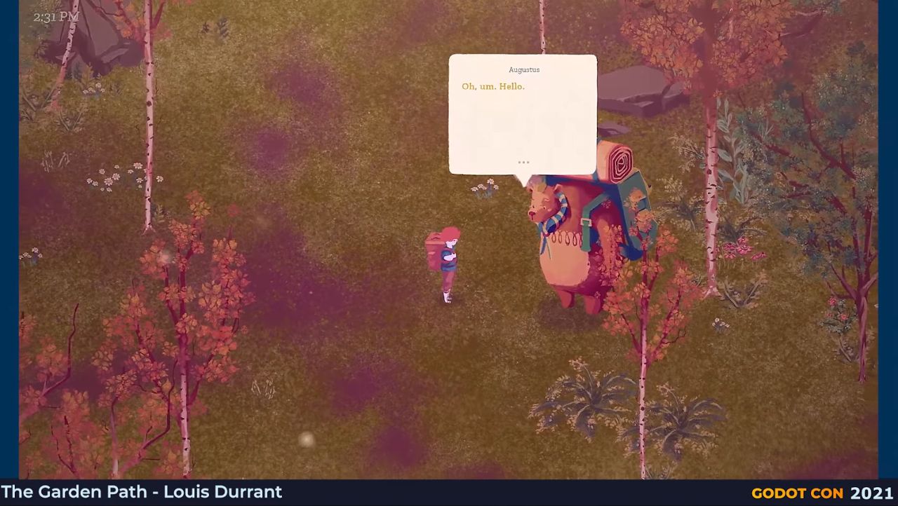
Most concerns seemed to arise from the size of the text of the characters, which is funny because it’s something I always felt was possibly too large. It’s a comment I’ll take with a grain of salt, since I imagine most viewers weren’t watching in fullscreen, as the game would be played. Instead, the video probably appeared in a smaller box in their browser. Something I ought to have planned for when preparing the footage.
Being able to change the size of the text wouldn’t be too hard to implement, although it’s place on the roadmap will probably be determined from playtesting.
Thanks to everyone who tuned in, it was a moment of great encouragement and continues to be. If you missed the presentation, it’s still available via this timestamped link.
I found myself pretty burnt out after delivering the footage, so took a well-needed break that would allow me to come back to the game with a fresh head.
When my head hit the pillow on the night I finished up the Godotcon footage, just moments after hitting the ‘send’ button on the email, my mind went spinning about a new system for character movement and object spawning. So I had this mulling over in the meantime.
Afterall, characters spawning in strange places and walking into walls was still causing me grief, and while the previous system of wayfinding (discussed in earlier blogs) works most of the time, it’s simply too obvious and too shattering when it doesn’t.
I thought then, why not have a constantly monitoring reference for where collisions are and aren’t? It needn’t be perfect or entirely up to date, as the existing systems would make for good fallbacks.
I began planning out a way that there would be tens of thousands of nodes all reporting back to a central system whether or not they were ‘safe’ or not.
It quickly dawned on me that haven’t all these nodes reporting collision was incredibly resource hungry, so I instead built it around a ‘sweeper’, a single area that scans from left to right across the map and makes note of what areas are safe and which aren’t.
The problem with that? It’s slow. It takes a certain amount of time to detect collisions, and despite being a fraction of a second, when accounting for thousands of distinct points on the map, that time adds up.
Instead then, multiple sweepers speed up the process exponentially without being too resource hungry. Sweepers detect which points haven’t been updated, assign themselves to that point and update them.
The result is oddly satisfying, painting a large map of where clearings are available. As the sweepers are the only ’nodes’, the rest is just data, which means it’s lightning fast. While previously routes could be built about twice as fast as the character walking, a route can now be planned in a split second, and with far fewer resources.
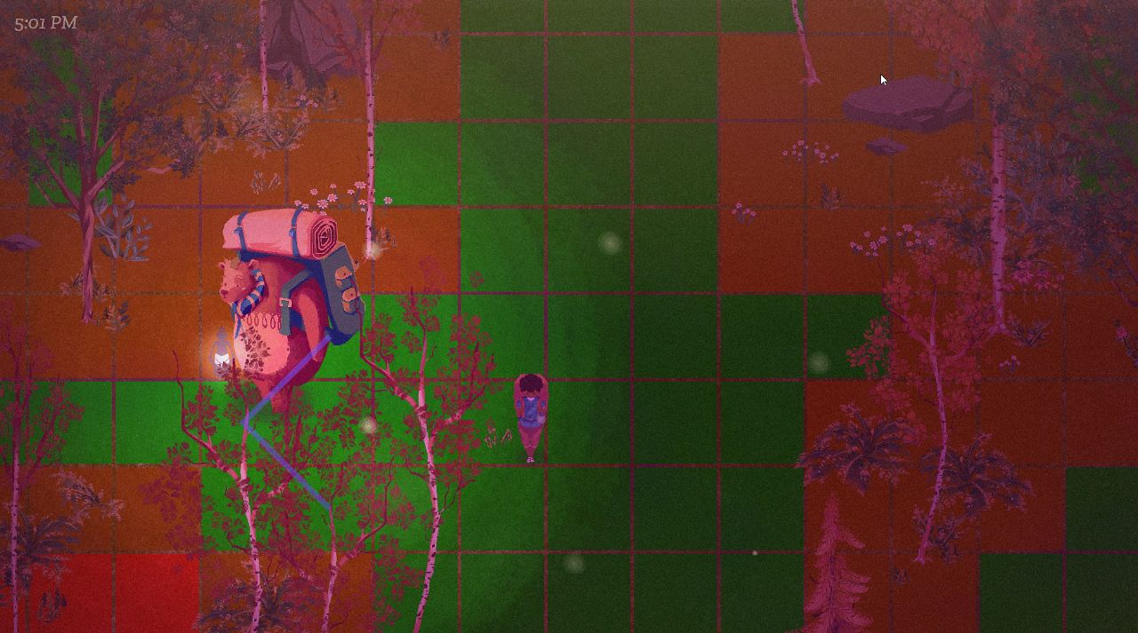
The potentially far greater use for this however is the reporting back of areas of a certain size. Malakai, the mysterious figure sat by the fire, is a good example of someone that would make good use of this. Malakai always appears by a fire, and so will always need a clearing of land to spawn into. It’s now just a case of asking the game to return back a ‘zone’ of a size that will fit Malakai and his fire, and he can do so without the worry about spawning on top of a tree or similar.
Items and characters added to to the world map can ping the sweeper to alert that the map has changed, and will need updating, then the sweeper can get to work and sweep the surrounding areas.
It’s a system that’s already paying off in big ways, and I’m hoping it will be the peace of mind I’ve been after.
In smaller news, the equipment menu has entered its third and (hopefully) final redesign.
Its first design saw each item fan around the player’s character, in-lieu of a ‘radial’ menu.
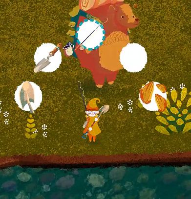
I needed to change it up since, during testing, it gave the wrong impression that the menu could be navigated by spinning the control stick to the angle of the item. I probably envisioned this when I originally plotted out the design, but a core part of game’s controls is the separation of movement and UI — movement on the stick, and UI on the DPad. This way certain menus can be operated with movement of the player’s character still available.
I eventually adapted the design for the items to instead hover nearby the items on the player’s backpack. I really liked the visuals of this, and while it looked neat in screenshots it was a logistical nightmare to implement, and was terrible to navigate.
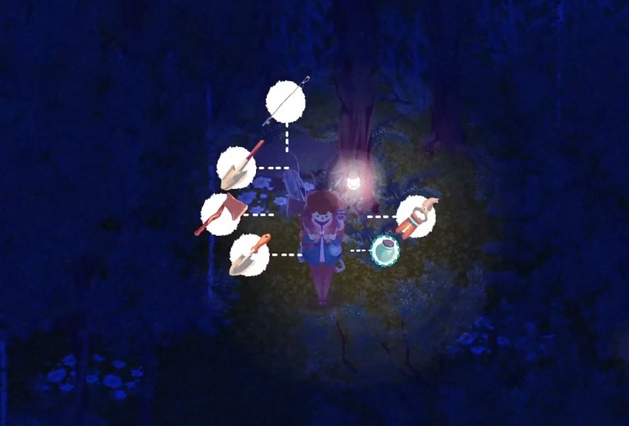
The implementation lead to dozens of different nodes each tracking the locations and offsets of the items, with realtime calculations figuring out their relational distances to one another, and the player, and the camera. Top that off with the fact that the player’s items can appear in four different configurations – front, back, left and right – and the result was a complete mess along all stages of its development.
The design also meant that each item could potentially be in a number of different locations, so you couldn’t always rely on muscle memory when selecting between them.
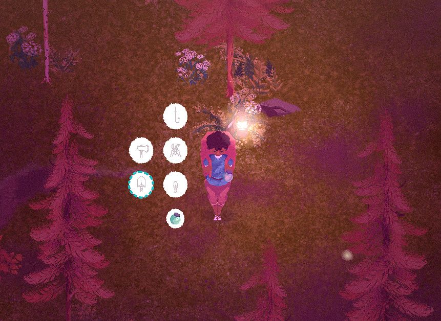
And so, in this third iteration, the items are simply presented in a vertical grid to the left of the character. It’s reliable, functional, and I personally think it’s the most appealing looking of the three too.
It feels great having this system finally streamlined, something I can set and forget. It does what it needs to, and nothing more.
Lastly, in terms of focus, with the tutorial largely blocked out and the event system functioning, what’s left is just bringing the save system up to speed with the new scale of the game and everything that’s been introduced.
Previously I had been dealing with saves of a few hundred props, but the game needs to reliably handle many thousands.
As anticipated, the game locks up when loading in all the spawn points due to the sheer number. I’ve become pretty accustomed to building a queue system to help pipe through heavy loads at a steadier rate, but maybe it’s no surprise that lining up thousands of props takes a good deal of time when going through them one at a time.
Instead, the spawn points are grouped into ‘parcels’ before loading into the tree, then those parcels are queued up and loaded one after the other instead. This speeds the process up by many factors, while also not cramming everything through the pipeline at once. A decent middle ground.
Given that the game has no loading screens once in-game, a slightly longer initial loading screen is a decent trade off. But, for now, you’re able to jump into the game from where you left off in under a couple minutes, and I don’t see it getting any worse from here on out.
Follow me on Twitter, or maybe even Mastodon.
>> Link to post.Thursday Report: The Garden Path in 2021
We made it to 2021! And with that the projected release year of The Garden Path.
While I didn’t reach my goal of the game being ‘playable’ before the turn of the year, I’m also much further along in ways I hadn’t anticipated.
I’m also immensely proud of the progress I made over the last 12 months. There are moments when playing the game myself that fill me with a deep joy for how close the game is to what I had envisioned all those years back.
Ambitions for the game have both grown, but also remained on a steady and manageable road. What was originally a game really about running around talking to NPCs and moving around outdoor furniture, now has what I believe to be some mature and defining mechanics – dustflies, song-fish, constellations, and a more in-depth gardening system to name a prominent few.
The rewiring of the game’s action system and ui system in the summer has really become the building blocks moving forward, allowing for new systems to be implemented so much easier, and helping futureproof the project.
For instance, while indoor-spaces were always something I envisioned really post-launch, it occurred to me I had almost everything in place to implement it within an evening. And sure enough, I was able to have the player character move in and out of a tent (teleporting the character between spaces) with just a few lines of code. I’ll be releasing more on this soon.
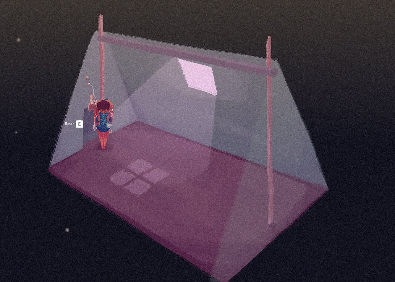
I’ll be drawing the line there! I think we have all the features we need now, and I think this final addition was the perfect icing on the cake. There is something special about being able to tuck away into your own personal abode that it felt wrong I was going to omit it. Just something simple for now – perhaps being able to unlock merchant tents in the future? Something to think about.
I’m currently caught between working on polish and playability. While there hasn’t been an announcement yet from Godot, I believe I’ve been lucky enough to secure a spot for GodotCon 2021 this year. The plan, should it go ahead, is to simply boot up the game and play from the start for 10 or so minutes. I’m hoping to strike a balance between demonstrating the game, and demonstrating the engine. There’ll be more information on this to come, but needless to say I want everything the player might experience in the first moments of the game to be as complete as possible before recording the playthrough.
Placeholder icons work great for playtesting, but for a demonstration they pretty quickly shatter the feeling of ’this is something I could play’.
With that all in mind, here’s some of the above-the-hood changes I’ve been working on, outside of artwork, animation and music…
Before, collecting from ‘flora’ props in the game didn’t feel good nor was it fun. This is something I had been struggling with since playtesting back in Spring.
There are two yielding actions in the game – with the axe and with the secateurs.
Chopping a tree feels good. There’s a weightiness to the animation, and if you aren’t able to yield an item, you can simply chop at the tree again, which is okay because it feels good to do. Secateurs collection used to follow the same principle, but it felt much worse. The player would, from standing, snip at the flora, and the game would roll if the player yields an item. This would process took about half a second. This ultimately would lead to mashing the ‘use’ button and feeling frustrated when nothing would drop.
I think the trouble is that a short animation feels inconsequential without any weight to it. Double that with the chance of failure, and the whole experience felt limp.
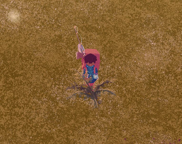
Now, the player has a much more deliberate animation. They kneel down by the plant, and do a more punchy upward cutting motion through the flora, then stand back up. There is also no longer a global yield likelihood – using the secateurs always returns a yield. In order to balance this, the item yielded is not always useful or valuable, but it’s something, and I believe part of our monkey-brain enjoys that.
I won’t pretend like the new action is fun like rollerblading is fun, but it’s a world of difference from the old player experience. I actually look forward to performing the action now, and in a game about gardening that’s a big deal.
As mentioned in my last post, creating acres for the game takes time. As such, I divided some of my time thinking of ways to fill the acres and make them feel more lively without relying on filling up the acres with unnecessary random props.
This involves rocks, inclines, dirt patches, paths and more. But I soon realized quickly I was trying to fill empty space, when it occurred to me that empty space in itself shouldn’t be seen as a bad thing. The ground texture, while nice, is flat and boring when competing with other more interesting assets.
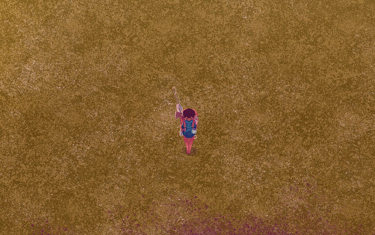
To combat this, I’ve introduced a third layer to the ground texture of more contrasting grass, made up of many separate sprites with a subtle animation. I think this goes a long way in giving a depth and motion to the underlayer of the world, and creating a small visual interest even when there’s nothing in the space. (Hard to tell in the still!)
Some work to the fishing mini-game has helped to give the player more visual and audio cues. From the playtesting players didn’t feel like the four-notes (from the four directions on the gamepad or WASD) translated well the to 2D grid. Instead, the single notes have been replaced with a fully whistled tune, and its placement on the grid now adjusts how the song is being sung – how softly, and how high pitched. This makes it more clear as to why the fish might be attracted.
The mini-game is always about striking a balance between something you can switch your brain off and enjoy, and something that rewards improvement of a skill. Before, most of the indication as to how well you were whistling was coming from the fish, but it’s both a lot of guessing work figuring out exactly how the fish is reacting while balancing your attention to the grid itself.
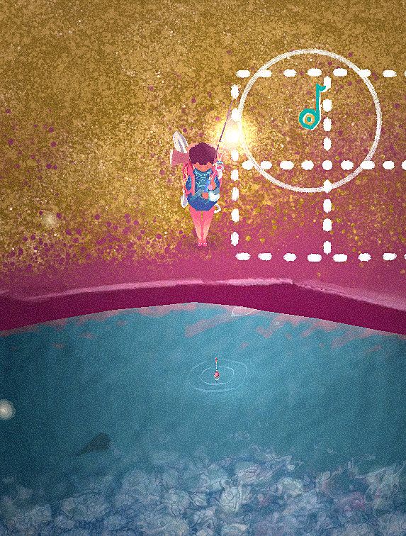
Now, once the note falls on the correct position, it will both display the area the player must maintain the note within, and also a timer to show how close they are.
As posted on social media, the player map now automatically generates itself against the world map. This sounds loftier than it is – since the world map is a series of acres places on a grid, the player map is much the same, only the acres are texture representing their world counterparts.
But this is part of a larger shift of attention toward the player map as an important utility. Before it was a bit of an after-thought, a quality-of-life inclusion that I wasn’t going to prioritise. But this feeling has since shifted as I put myself in the shoes of a new player.
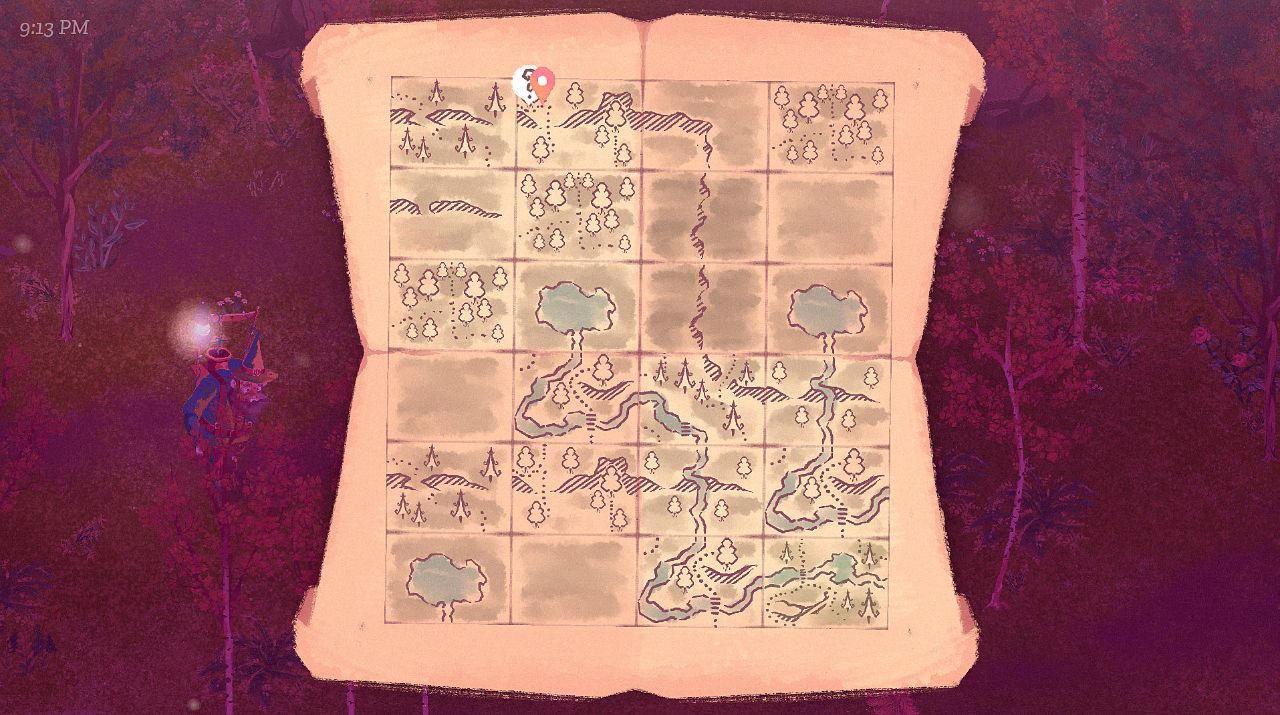
I have expanded the errand (quest) system to now recognise a wealth of different actions, whereas before they were limited to collecting certain items. With the new tutorial the player will be required to return to a number of NPCs, some of which move around the sizeable map with free-will.
The map is important to both help players track the whereabouts of themselves and NPCs, but also to alert the player that something may have changed in a certain location, urging them to go there.
This means I can avoid the alternative of boxing the player in to a portion of the map so that they aren’t overwhelmed. I toyed with the idea of locking away parts of the map – both to guide newer players and provide motive to move forward. Something about this felt wrong to me, however – I much preferred the idea that the player can explore every corner from the start, I feel like I would be gamifying the world otherwise.
The world should feel as though it’s always been there.
Follow me on Twitter, or maybe even Mastodon.
>> Link to post.Thursday Report: Carving a path.
Development for The Garden Path has been gun-ho as we’re thick into December and the race is on to meet my personal goal of having the game ‘playable’ before 2021.
‘Playable’ has never in my heart meant ‘released’, but more so a state where the game can be enjoyed for what it is, ready for polish and filling with content. It’s difficult to draw a line for exactly how on-schedule I am. While originally the plan was for last year to focus on the game’s systems, and this year to focus on content, really 2020 has become something of a muddy middle ground—neither a good nor bad thing.
I always had a gut feeling the back-end development would prove itself to be a bigger beast than I anticipated, and while that’s been certainly true, it hasn’t been by nearly as much as I’d dreaded—and I feel as though I can see the top of the summit for the first time.
Really at this stage I’m ironing out the creases, with no huge jobs left on the roadmap, it’s a case of implement content, test and see, implement content, test and see. And, as each crease smooths out, it becomes much easier to block out content and plan for final assets.
And since so much of the game’s content is actually found within databases that already tally to entries in the thousands, it’s easy to forget just how much works out of the box while the box is still sealed shut.
But I shouldn’t get ahead of myself, there’s still a long way to go. Here’s a few points I’ve been working on since our last report.
Characters now more intelligently move around the garden through an ad-hoc pathfinding system and waypointing. This is crucial, as before characters would pick a random point on the map and move toward it—if an obstacle blocked their way, they would simply choose a different random point. Instead characters can now have a final and absolute destination in mind, and plot a route out ahead of time – if something blocks their way, they don’t change destination, they calculate a new route.
I did this by repeating two processes until the route it complete. First a ‘ghost’, an effigy of the character themselves, is fired like a bullet from the character toward the final destination – unless they’re stood in a huge empty field, the ghost will inevitably hit an obstacle. Once it does, the second process kicks in that I called ‘whiskers’. These are two feelers that rotate in opposite directions – clock wise and anticlockwise. Each whisker is racing to be the first to declare two points – at what point it is no longer colliding with the obstacle, and when it hits a second obstacle (or rotates without hitting anything for 180 degrees). The point between those two points is returned, the ghost then fires from that new spot, the character notes to move toward it, and the cycle continues.
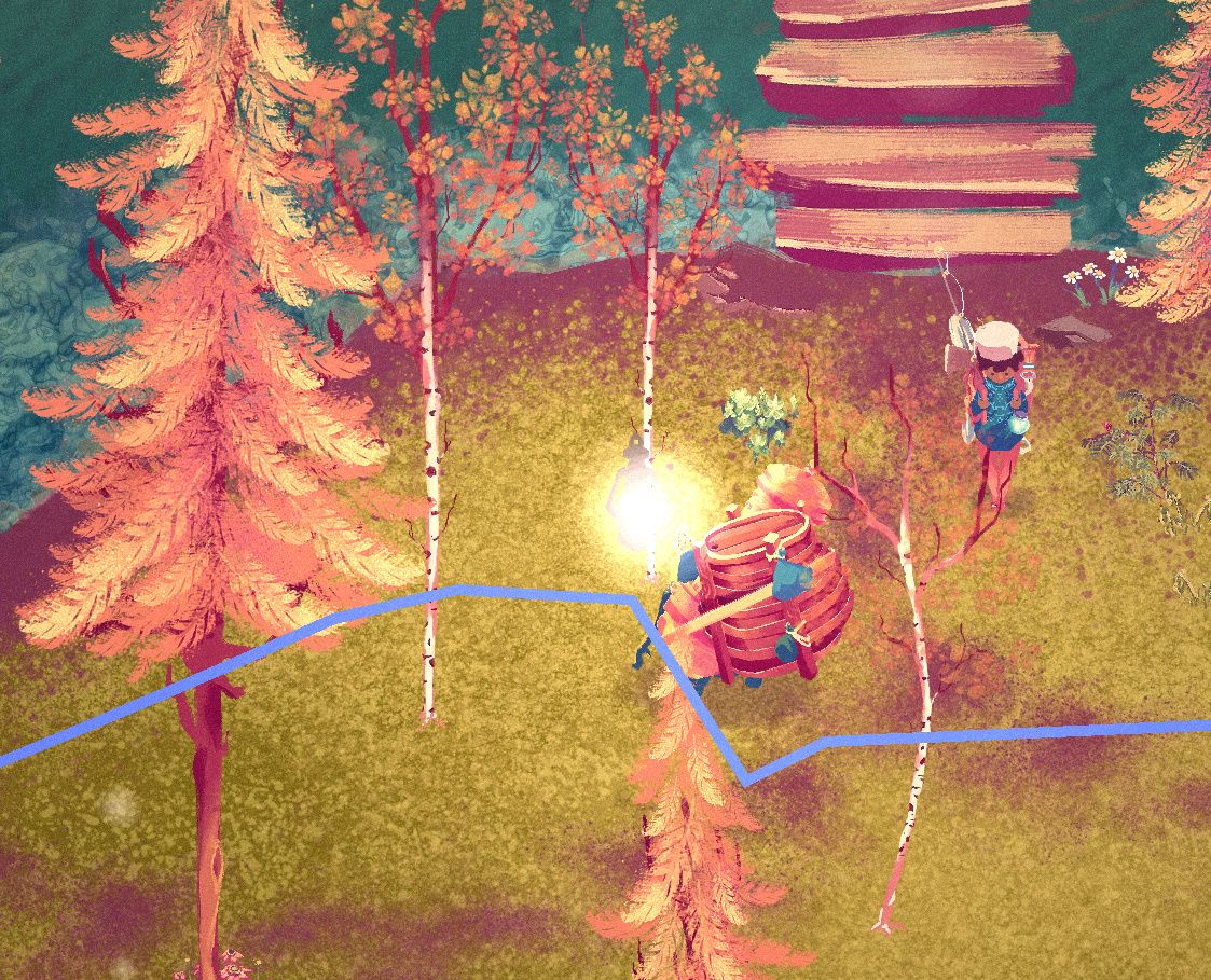
The system isn’t perfect. While having two whiskers racing one another will help find the quickest way around an obstacle, it doesn’t necessarily result in the quickest route to the final destination. The logical step from there would be to calculate many multiple routes and compare their lengths. Fortunately this isn’t a MOBA, it’s a stop-and-smell-the-flowers type game, so I’m not too concerned for now. What’s important is that it feels like the characters have somewhere in mind to go, and in that regard it feels leaps-and-bounds better.
However I soon notice a critical error caused characters to bounce back and forth between two points. When testing the next angle to move around an obstacle from a new point, the previously losing whisker may find a gap sooner, meaning the character turns around and goes back the way they came. This had me stumped for a while, but the answer was fairly simple – so long as the obstacle remains the same, the losing whisker always sits out. That way, even if it’s not the most efficient route, the character will commit to it, be it moving around clockwise or anti-clockwise.
Characters are now (very often) weaving through trees like it’s nothing. It likely isn’t oven-ready for release, but I’m really happy with where it’s got me for a day or two’s work.
What isn’t being ‘built in a day’ are the acre designs. In accordance to my original idea of balancing purely RNG maps with predesigned maps, blocks of land called ‘acres’ and put together like puzzle pieces. While these acres in previous alphas have felt a little bit like random assets spewed over some grass, I really want to create something that feels like a believable and organic world.
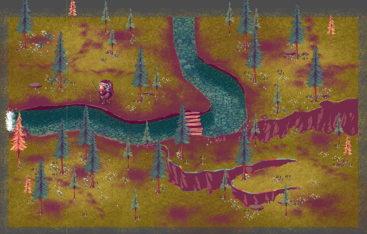
What was originally meant to be done on a Sunday afternoon is still looming over me after two weeks. As it turns out, placing individual bracken. Fortunately, it’s pretty damn satisfying. With a lot of the assets complete and ready to drop in, it’s a bit like playing a version of The Sims where everything is something of my own creation. Finding interesting ways to combine rivers and cliffsides, rocks and waterfalls, as well as make each corner feel like it’s settled there for many years, or even carving out spots the player might choose to use as their hub, is a fun challenge.
And, with all these dense patches of foliage, I thought I’d take a break from map creation and actually see how it feels to move around them. As anticipated, the more flora the harder it is for the player to deliberately aim and select which flora they want to act on. While the existing action systems works fairly well, simply returning the prop that first collides with the player’s RayCast (streamlined with some context-sensitive prioritising), if the player couldn’t very deliberately choose one plant from many, then sense of control is lost.

A new focus mode, which I shared on social-media a week or so ago, was a quick implementation that has done wonders. By squeezing the Left Trigger, the player strafes and walks much slower and a small crosshair emits from the player to help select the object. The crosshair itself is just an Area2D moved with the joystick, returning only interactable areas of other objects. As Godot’s YSort puts the object with a higher Y value in front of those with a lower Y value, we can easily detect which object is visually in front of the other by comparing those values, and prioritise the one that seems closer.
My focus now is the new player experience. How is the player introduced to the game’s mechanics, and encouraged to discover what’s fun for them. How are each of the characters introduced, and how is everything paced. For a game based on real-time, just how much can the player do on the first day?
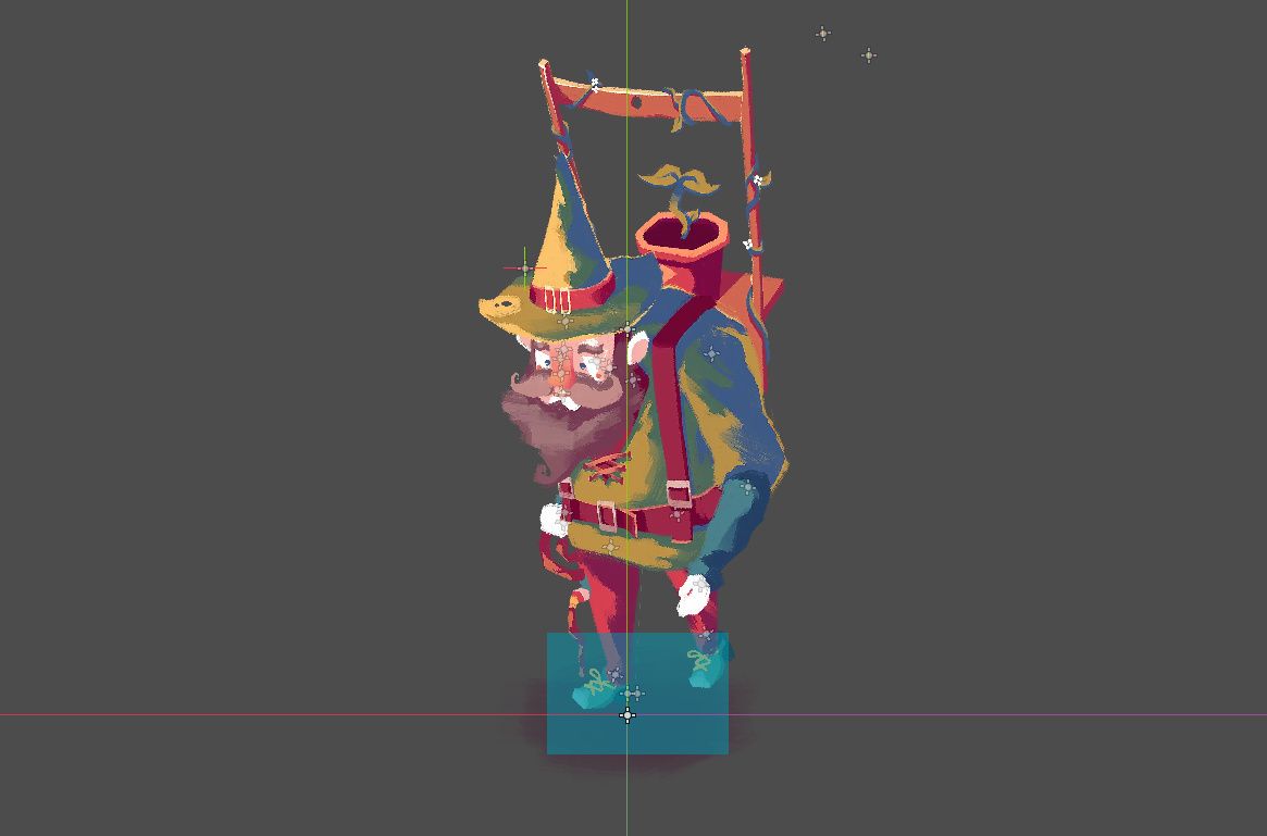
That will require finding a balance between keeping the player engaged, and keeping them excited for the days to come.
Follow me on Twitter, or maybe even Mastodon.
>> Link to post.Thursday Report: 30 Characters
Another year, another inktober come and gone. This year I decided to aid the development of The Garden Path by illustrating a new character each day – you can read more about it in the post below. I thought I’d spend a bit of this report looking back at how things went.
Firstly, this was the first time I’d done a digital inktober. The original idea behind inktober was to get people away from computers and back to drawing on paper. Truthfully, I did miss getting the pen and ink out at the end of a day, even if I know the relief of not having to do so for another year is always an immense feeling at the end of it all.
I spend most of my day illustrating digitally, and so after finishing work it was a little bit hard to remain motivated after clocking out. Dinner, which would typically be a time to wind-down, suddenly because just another lunch break, as I’d be hitting the computer once again for another hour or so.
But ultimately once I would get started there wasn’t a character I didn’t enjoy drawing in the moment. I should stress the brevity, time spent on each of these characters probably averaged out to about an hour. As such, most I see an unfinished or at least in need of review. Any failures I had to suck up and publish anyway, because that’s the nature of the event.
Not that there were too many failures across the board. Perhaps the best example of what I could consider a failure is Archer. I have a soft rule that if there are multiple characters of the same vegetable, I should try and choose a different variety or approach to avoid things getting samey. A good example of this would be Olga and Oliver the onions – two characters which came out really well. One is a sliced red onion, the other is a whole brown onion.
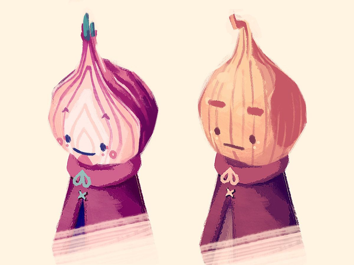
Archer was always going to be a little risky because the higher concept was to draw a non-conventional vegetable, ie. the kind of vegetables you don’t see on super market shelves. I thought ‘what if the character almost had another carrot growing off from them’.
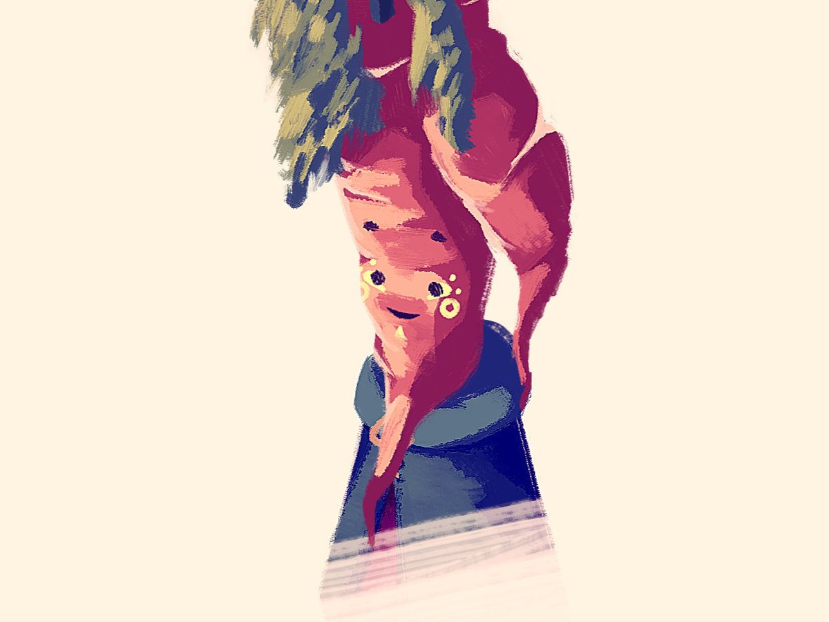
I’m not too sure what went wrong, but it’s likely down to an imbalance of simplicity and complexity. The shape of the character is complex, but with complex rendering there was too much detail to fit in a face without the character feeling cluttered. In the end the rendering is flat (and oddly shiny) while the face is doughy and boring. I think I’m onto something with this character though, and will definitely be returning.
Jaime and Harriet are two characters with naturally very tall heads. I recall being very happy with each at the time of publishing, but on reflection they feel a little out of place. I’m reluctant to give all the characters ._. faces, as popular and appealing as I know they are, and on the tall character it seemed especially hard to fit that design in.
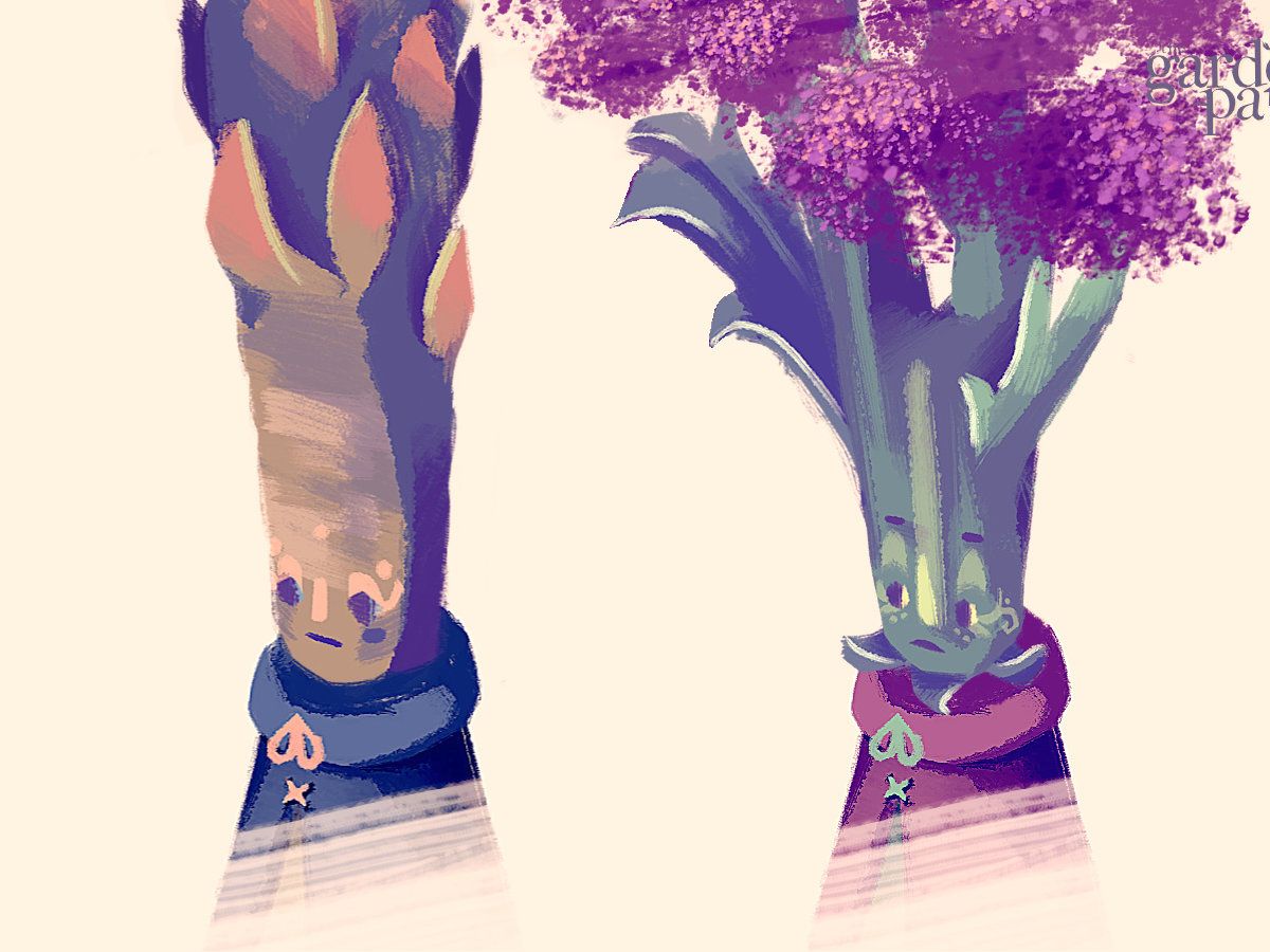
As such they’re a little bit more human-like with their noses and wide eyes. It may be difficult to read their faces in game, and I think they both need to be made more characterful in general. It may well be that the issue is their heads are far more interesting than their actual faces, and I’ll need to decide whether the aim is to out-compete, or allow the upper-details to steal the show.
In general I think a lot of the characters come off perhaps as too ‘cute’. Cute characters are often so because they are simple. That’s okay, and many of them will remain cute, but I want to make sure they all have enough depth to be three dimensional characters, rather than aspirational plush toys. The world of ‘The Garden Path’ isn’t dark by any stretch, but it isn’t designed to be purely good-vibes either. Ideally each character should have something about them that’s a little bit imperfect or unusual, something that might not be instantly appealing, but hopefully becomes an important part of how they are identified.
Development on The Garden Path has otherwise been mostly clinical. Crucially, I’ve been slowly building up a event system that allows for pre-scripted moments to occur for when they are triggered.
In a funny way, it reminds me of my time working in Visionaire Studio, where you build a game primarily using 50-or-so pre-written functions especially geared toward story-based adventure games. ‘Move character’ for example, ‘Begin cutscene’, or ‘Cue music’. I’ve been plotting out the important functions I would need, so in theory the game can just reel through all the commands from a spreadsheet, rather than from in-engine code.
It won’t be like Harvest Moon where scripted cutscenes are kicking off any-which-way, but certain key points, like starting a new game, or seeing in the new year, will need instructions.
Once that’s all in place, the game will, in theory, be functionally playable for the first time. While before the alpha was mainly testing each of the game’s mechanics in isolation, we’re on track to have a playable experience by the end of the month.
The game now performs much better (better framerate, less stuttering) with some further tweaking to how the game brings in and loads out different props, and the game also now autosaves the game periodically. In addition, it now saves when the game is closed non-forcibly (ie. Alt+F4 or clicking the X in the top right hand corner of the window.
All save data has been streamlined now to be housed in just a few dictionary containers, vastly reducing the work required swapping in and out the individual save data entries back into the game, while also offering flexibility to how much data is necessarily stored. This has made working with save files much easier.
Oh, and the player’s footsteps now change noise depending on what surface they’re on.
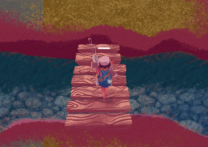
Plenty more to share in the upcoming weeks.
Follow me on Twitter, or maybe even Mastodon.
>> Link to post.Thursday Report: Content of Character
‘Tis the season of Inktober in the online art world, and while I usually enjoy the challenge of taking a step back from digital art, I figured this year I would utilize the time usually spent on the official prompts (of Jake Parker’s) to aid the development of the project.
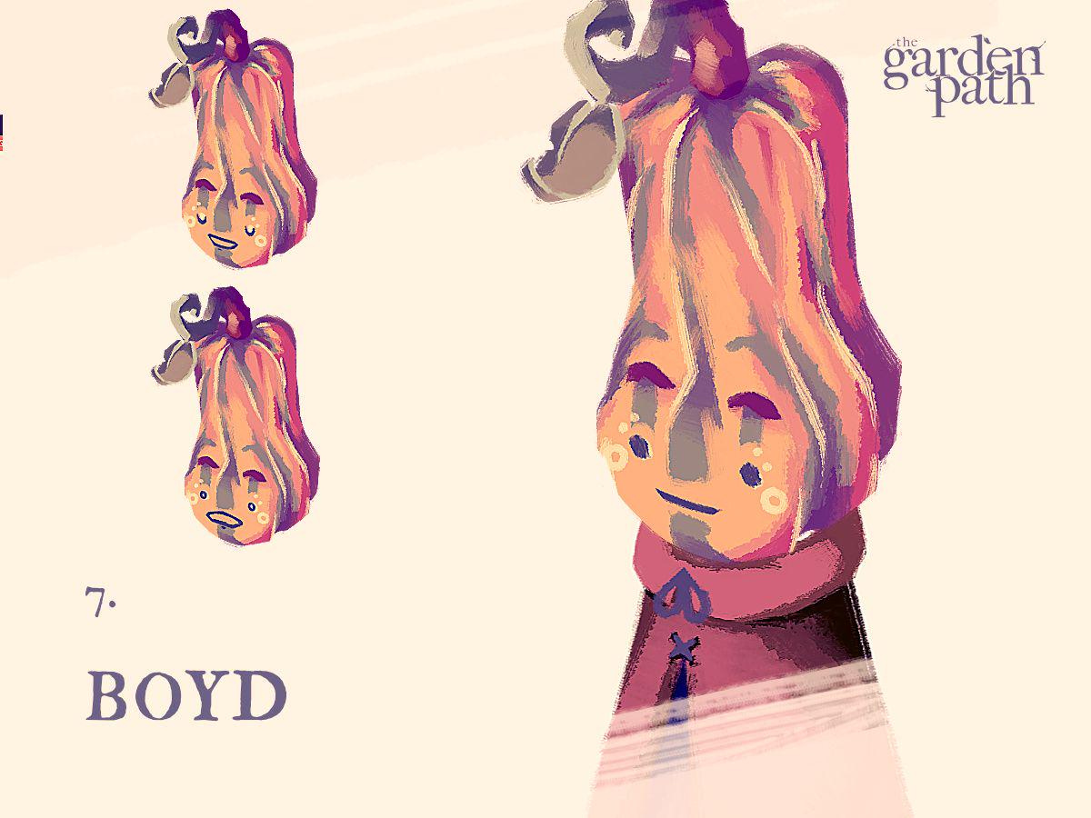
If you’ve not been following me elsewhere, I’ve been posting a new vegetable resident each day on social media, and will be doing so until the end of the month – in theory leaving us with 31 new faces.
With a total of 50 residents planned for release, and roughly 10 residents completed prior to the month starting, this will put me in a very good position for release. Do note that all time spent on these characters is in addition to usual development time, so everything else is still being built in tandem. Inktober should always be a challenge, and this approach poses both new perks and new trials.
I’ve built the style of The Garden Path to allow for quite rough artwork, which allows for quick art generation on a good day, but difficulties expressing certain shapes and shadings with such broad strokes on a bad one. I imagine very few of the villagers I share will be considered ‘final’, as I need to draw the line under each piece at some point so I don’t totally burn out.
I’m generally happy with each resident so far, although with each one I’m learning a little more about expression, colour and shading as it fits into the game as a whole. I’m sure I’ll be revisiting each one before the final release.
Stay tuned for many more to come.
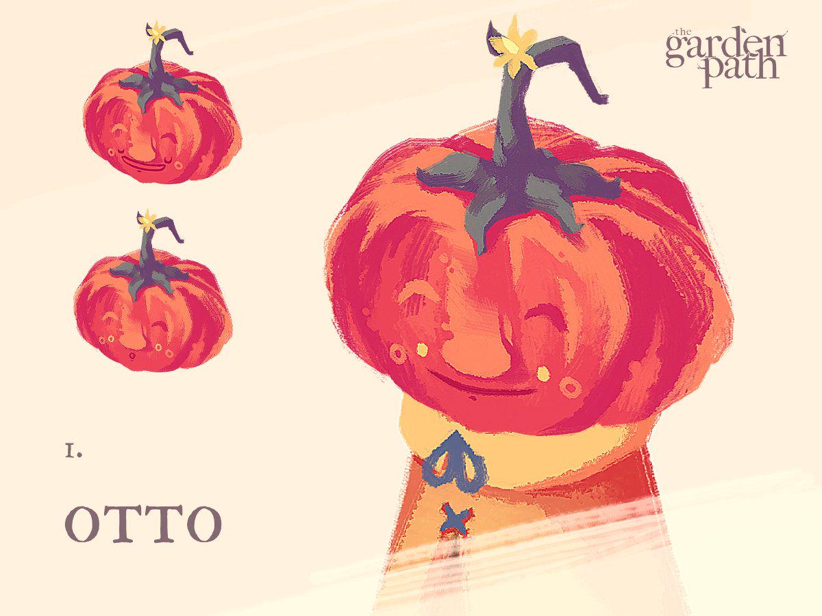
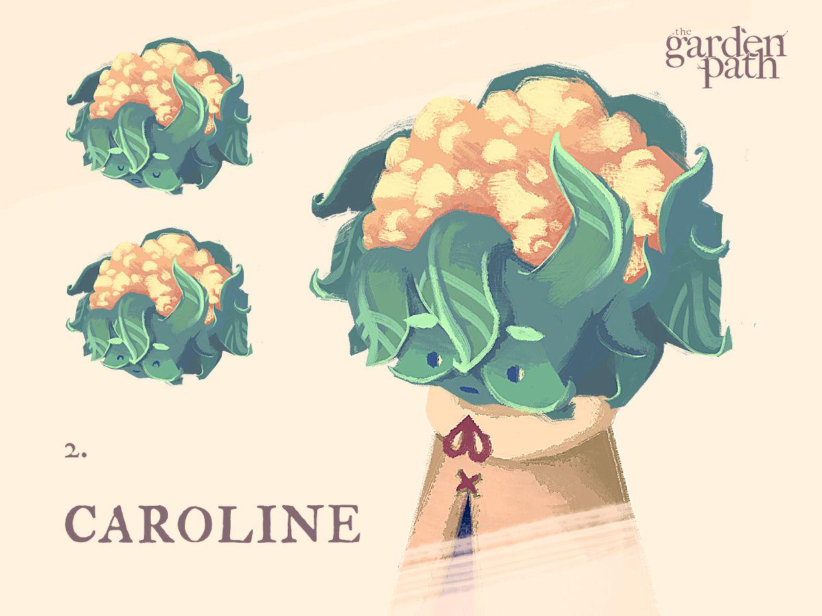
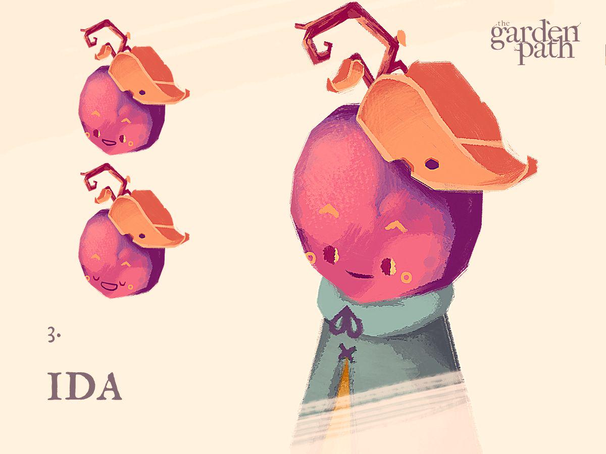
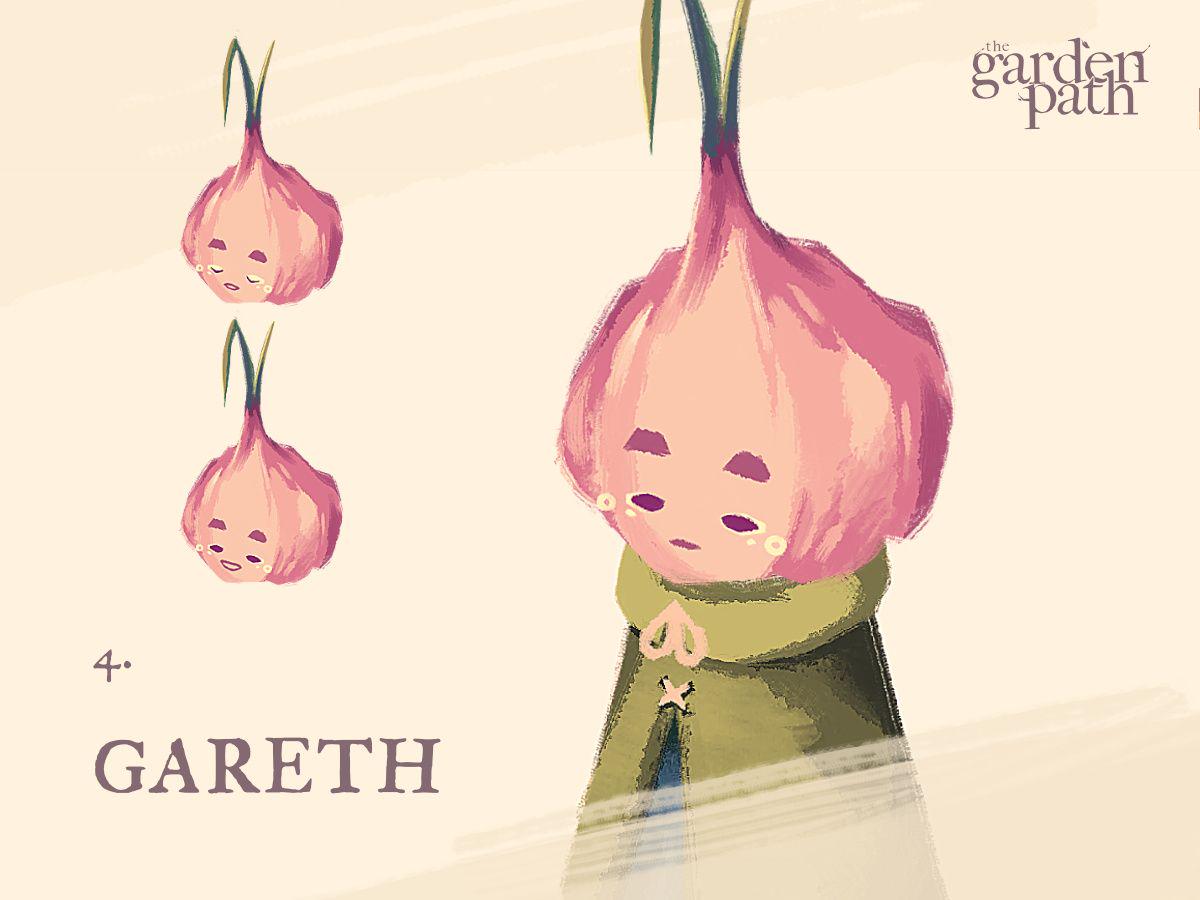
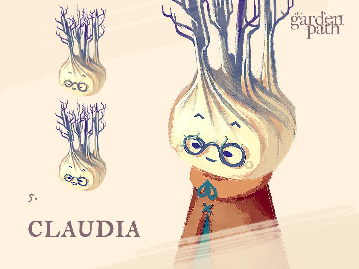
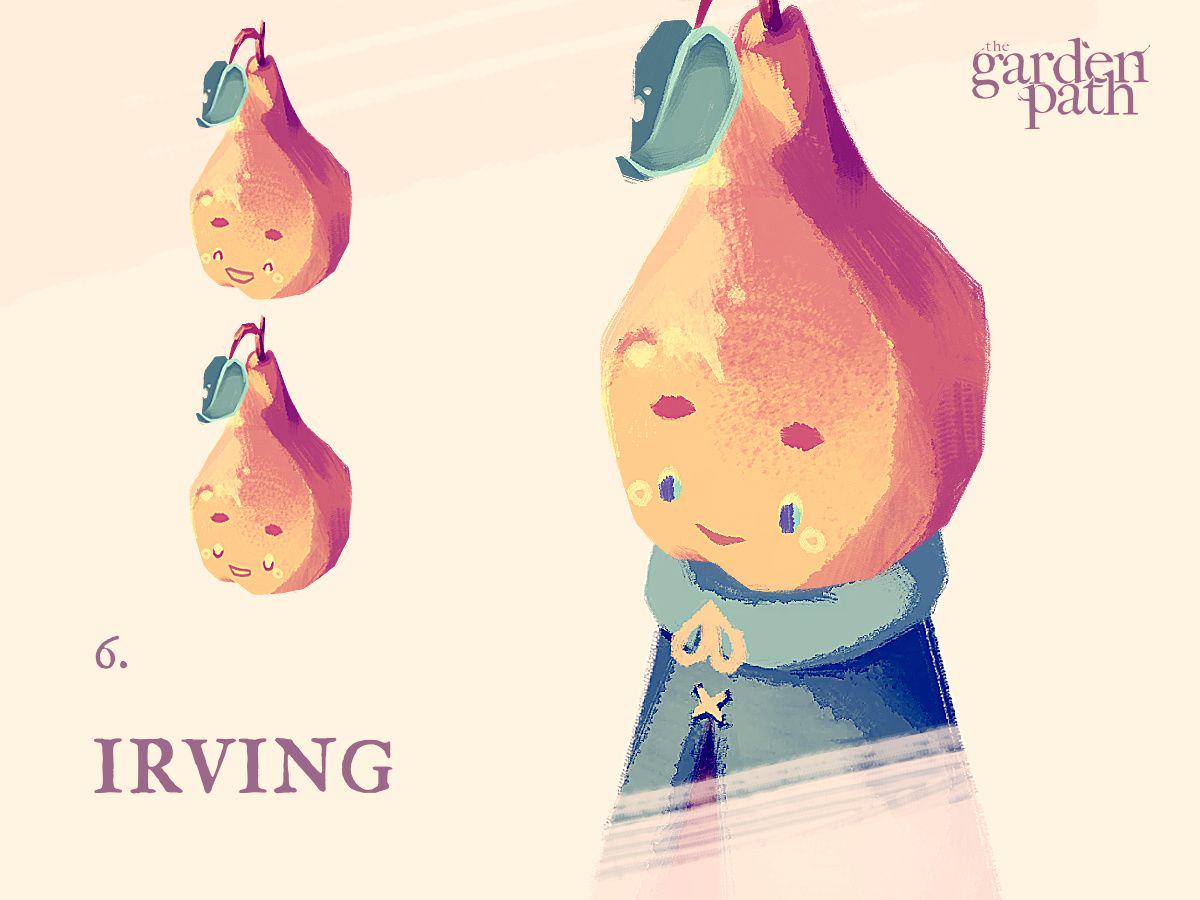
Progress otherwise has been polishing and expanding the game’s existing systems, particularly the seemingly-never-ending work on the game’s item and inventory systems.
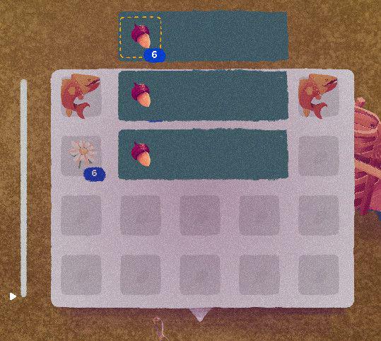
As mentioned in my last blog, items with the same ID but different characteristics will form ‘stacks’. This is something I wanted to weasel out of, but eventually admitted to it being a necessity. By allowing items to carry their own characteristics, you open up a huge wealth of interesting possibilities within the game’s economy, but you need to allow the player the agency to select what item with what characteristic they want.
You can do this by either creating a separate item slot entirely, using up the player’s inventory space, or you do it by providing a new menu. While still in development, progress on the latter is coming along nicely, and has been my primary focus this week. In theory, if an item is in a stack, when selecting that item the various versions of that item become available, grouping those with identical characteristics, and those with unique ones.
This will be especially useful for the player to avoid or select higher grade items when trading, or possibly a system where items age the longer they are held in the player’s inventory.
It’s not entirely glamorous, but it’s working. I suspect adding in an option so that the player can skip the middle man and just pick an item regardless of it’s characteristics would be a good quality-of-life inclusion.
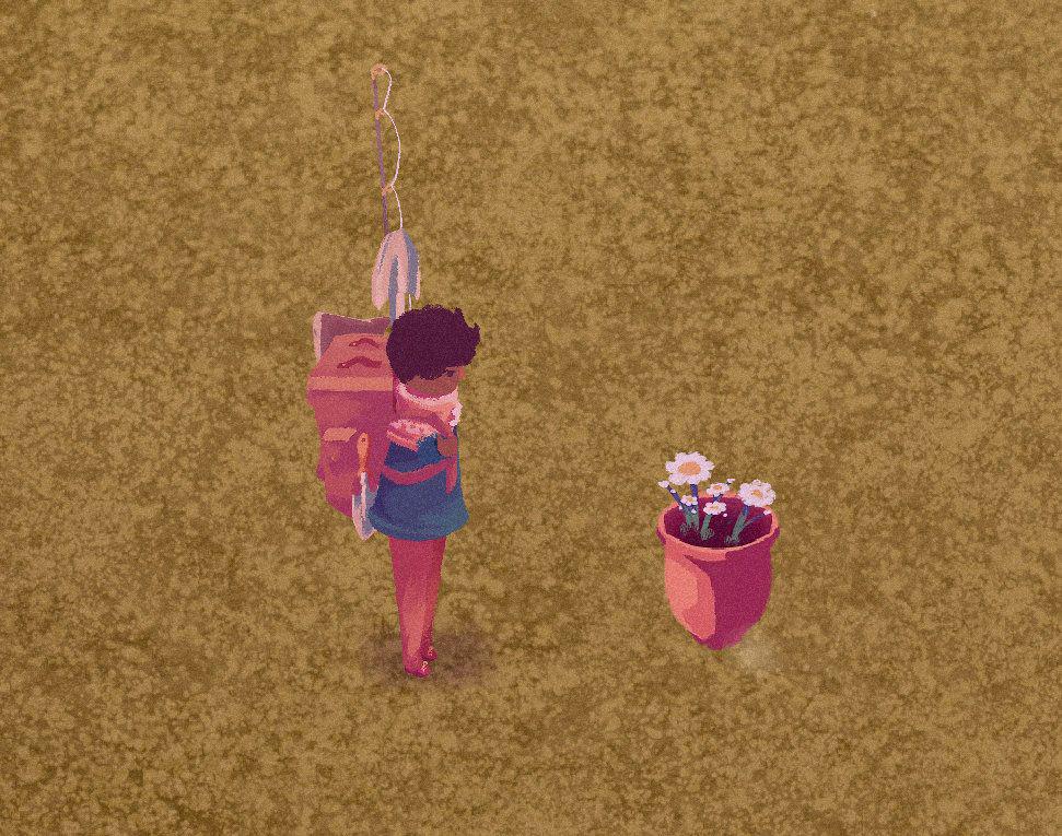
Another mechanic I couldn’t face omitting was the inclusion of planters and pots.
It occured to me that I could use the same system as storage items for the player to move small plants in and out of a planter. Larger planters will have additional slots, so you’ll be able to mix and match different plants, or have one bursting with one type of plant.
The trouble came with the practical element. The planter itself a is a ‘prop’, but so too are all the plants in the game. Originally I had intended for the plants in a planter to be purely aesthetic, but this seemed too shallow – it feels wrong that you can only collect roses from those grown in the ground, but not those grown in a planter, for example.
Plant props contain a large amount of data – how old they are, how far into bloom, how healthy they are, and so on. All props are individually registered in one map file – the prop would have to somehow be contained within the other prop for it to work, as the plant and planter don’t exist tangentially to one another, they are intrinsically tied (the plant is in the planter)
Fortunately, since I introduced a way for any prop to save and load any amount of additional data (by essentially appending a dictionary to it), I was able to build onto the code I had so that any changes made to the plant will be superseded and written directly within a single class to the parent prop instead. In essence, props in props.
Currently the code only allows for two levels of props, but there’s no reason it couldn’t be infinite – I just can’t think why I would ever need to.
Follow me on Twitter, or maybe even Mastodon.
>> Link to post.Thursday Report: Growing Up
A fairly big feature has finally seen its way into The Garden Path – knees!
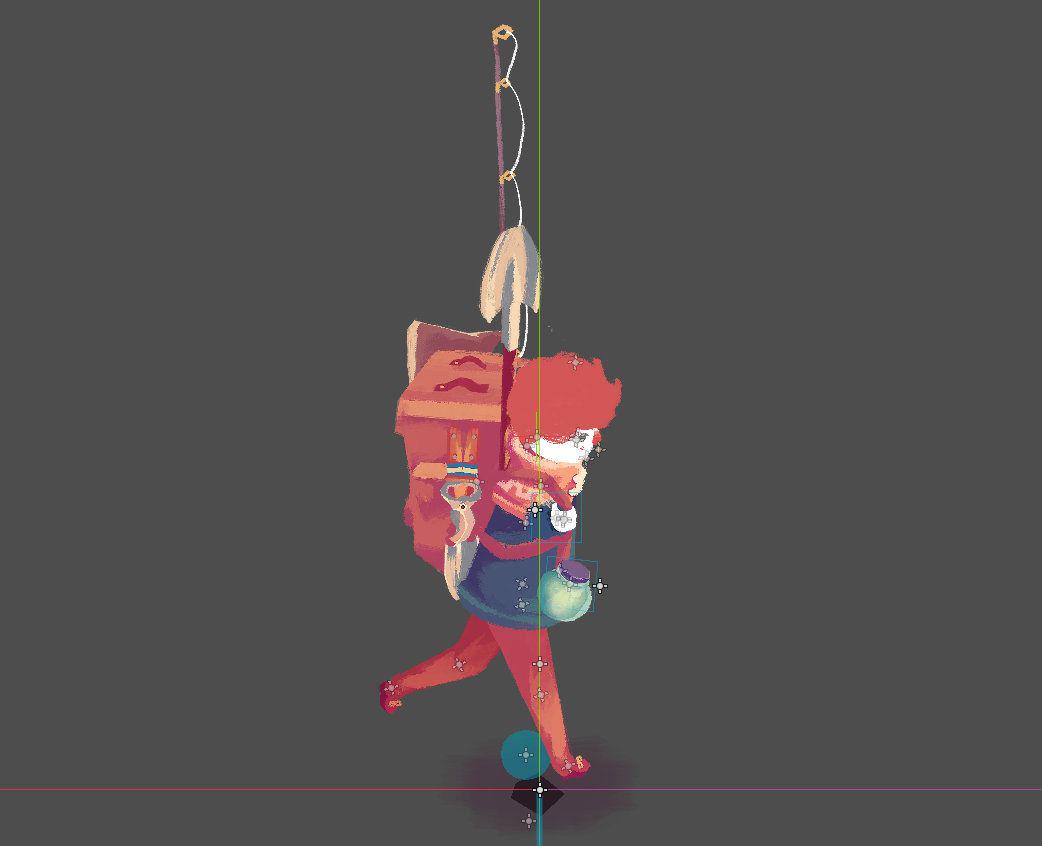
Mind the jest, but this was something I had been reluctant to include for quite some time, but they’ve proven pretty invaluable.
While certain animations, like running seen from the front, effectively masked the lack of functional knees, I was beginning to lose hope I could make other animations convincing. I had to face the truth that I would need to separate the top half of the leg from the bottom half.
Running as seen from the side, for instance, previously had the legs always stretched fully outward. Try running without bending you’re legs – it’s not comfortable and it doesn’t look comfortable. The new animation better matches the front and back animations, making for a smoother transition when turning.
The use of the trowel was the other key animation that I had to reluctantly admit required knees. While in the previous art-style the character digging a hole from a standing position kind of worked, the newer, likely more true-to-life style, virtually requires the character to actually kneel in order to reach the ground to convincingly dig a hole.
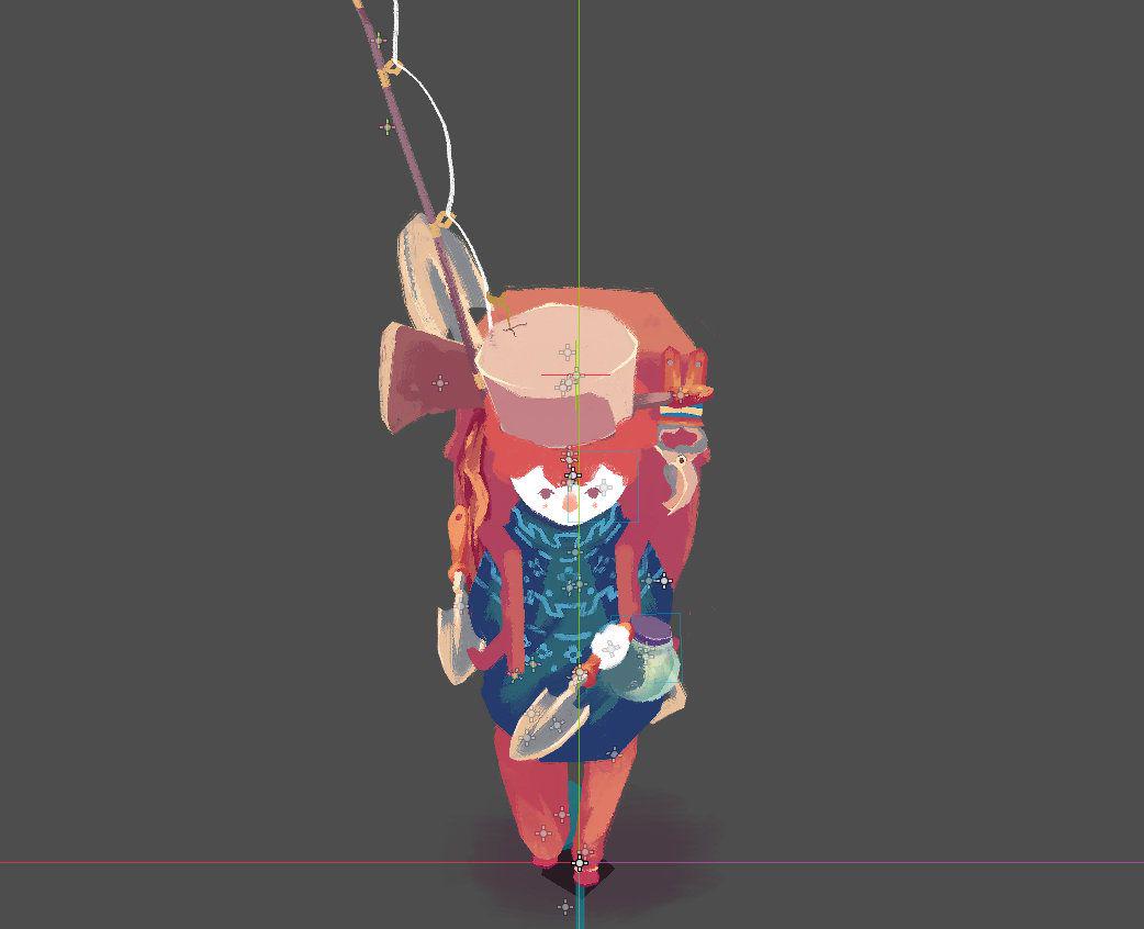
As it turns out, the inclusion of knees, thanks to layer masking in krita, is actually fairly simple. As all base layers in my art files are single-colour with no details, and details are all masked on top, I can split the base layers of trouser texture into two – above and below the knee – and simply toggle their visibility. The details will then overlap creating a fairly seamless joint.
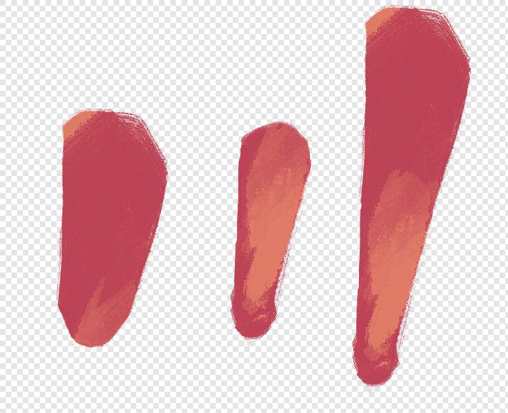
I’ve been using a similar method for tree trunks – trees and legs are really quite similar.
The rework of items into Godot Objects, as mentioned in previous reports, has been the focus of the last few weeks, and things are all finally starting to settle into place.
A brief fear set upon me – that I hadn’t considered whether or not an Object would be saved onto the text-based save-file format required to save the player’s game. If not, this would require the game to break down each object, and build each one back up again, for every save and load.
Fortunately, Godot is sophisticated enough to save everything it needs, and build everything back up itself from the text – saving me a headache!
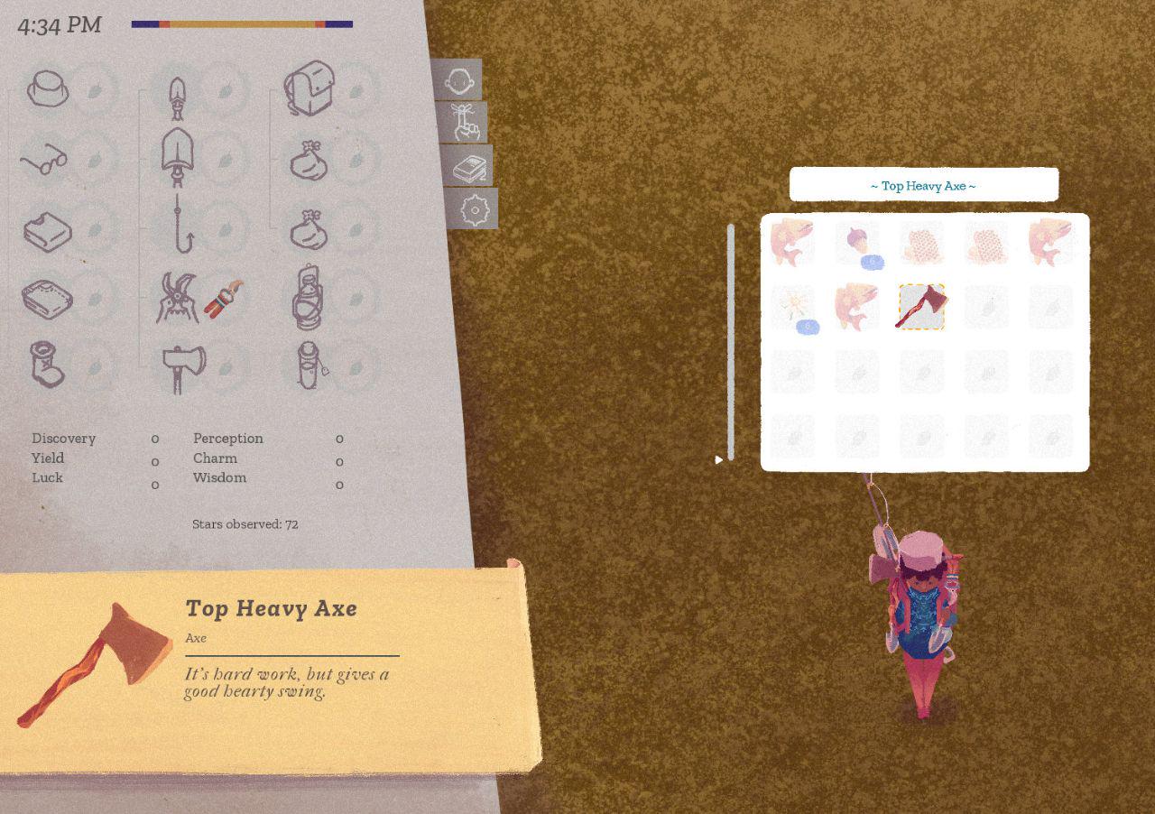
It’s been a fairly arduous process rewriting a lot of old code to work with the Item Objects, work that unfortunately doesn’t lend itself to pretty screenshots.
It’s something I both didn’t know about when starting Godot, and something I wouldn’t need to utilize giving the smaller scope of the game, so I don’t regret the time spent. It’s all a learning experience. Items and UI were always going to be the two biggest time-sinks in development, but it’s important to get them right, and important to make them scalable for future content. This change will do both.
Otherwise, I’ve been working on fleshing out the gardening itself. Players can now dig up certain plants in their garden and transplant them elsewhere.
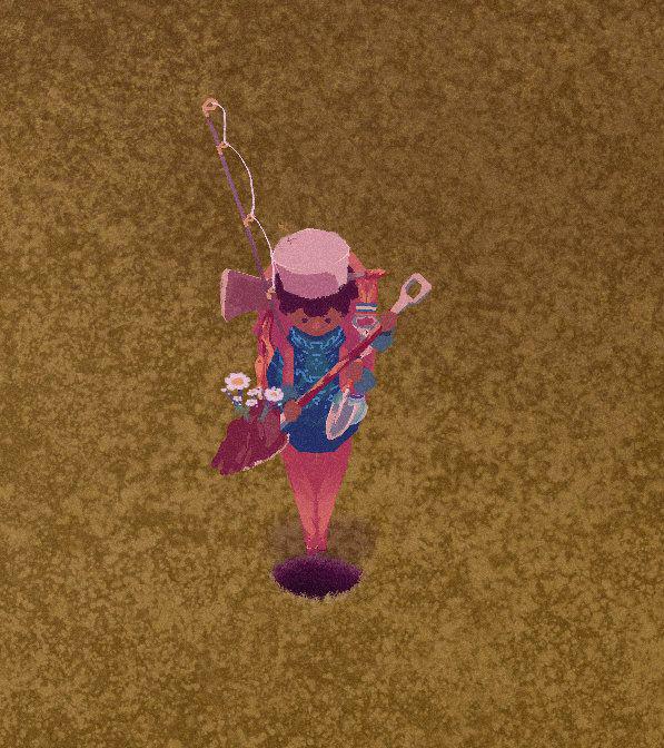
While in real-life soil can be either acidic and alkaline, I decided such a direct imitation of the real world is both a little lacking in romance, and also much harder to balance and turn into satisfying gameplay.
So, instead, soil is on the fictitious scale of being either Rich or Aromatic. The (loose) idea here is that deeper, earthier herbs and spices prefer rich soil, whereas more floral and delicate botanicals prefer aromatic soil. While we could debate for days which herb ought to fall where, the important thing is that different soils yield different results. Players may experiment with different levels of each, resulting in different coloured flowers, for instance, and will need to figure out which plants prefer what soil.
Mosses can be added to soil to make it more aromatic, whereas dead leaves can be added to make them more rich. Our friend Buttercup, the mining pig, has the side hustle of selling the soil she digs up to gardeners in need of specific soil-types. Very high scales of either rich or aromatic will result in different, but similarly valuable yields.
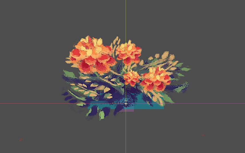
Lastly, introducing flowers themselves into the game. While I had previously selected which flowers to include by their practical purposes (ie. whether they can be brewed into tea), I’ve started to expand the selection for the simple sake of aesthetics. A gardening game might feel a little empty without the ability to arrange flowers.
After long internal debate, I’ve decided flower’s growth will be determined by the number of days that plant has seen of a certain season. Some plants will need more days than others, some will bloom all at once, others will be more staggered, some are delayed, and so on.
This is important because players will have a good deal of power when it comes to controlling the seasons. Decisions on what seasons the player casts the garden in will have consequences on what’s able to grow.
As I’ll discuss in a future report, growing the right things at the right time will prove important.
Follow me on Twitter, or maybe even Mastodon.
>> Link to post.Thursday Report: Mapping It Out
As most of the game mechanics are fleshed out now, we’re back to the nitty gritty rather than the theory. Here’s some of progress I’ve made over the last couple weeks.
I shared on Twitter and Mastodon a little while back about the small change in the radial menu. Originally a circular menu appeared around the character allowing you to quickly select which tool you wanted to use. This bred from the idea of a menu you could pin different items to, allowing the player to choose from any item. I soon abandoned this idea, as I wanted tools to be something you actually equip to your person – ie. the tools don’t all sit in your inventory until you want to use them, they are added to your ’toolbelt’ and contribute to your stats, whether in use or not – a bit like a typical RPG.
The system was to improve on how Animal Crossing did tools, wherein you simply go to your inventory to select the tool you wish to hold. Admittedly, I winced a little when I saw in New Horizons they actually introduced a radial menu – seems we had the same solution in mind!
I had to change the design anyway, as I wanted to include an extra tool – the firefly jar. I was eager to come up with an alternate solution so it didn’t feel too similar to the system found in New Horizons while I was at it.
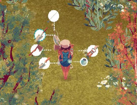
The new menu not only has its own identity, but better falls in-line with my UI philosophy – to tie everything to the game world. Now each circular option points to the item on the player’s backpack, rather than abstractly surrounding the player.
Originally the game’s map would be tied to this menu, but I decided an easier way about it was to tie it to its own hotkey – M or R3. This way it could be done in just one action, rather than a small handful.
Speaking of the game’s map – the game has a map! It was a simple inclusion, as it just pings each character’s global location while the map is open and translates it to a much smaller space. The rest is simply a case of having the artwork reflect the game’s world. As the game’s map is a selection of different chunks, this is just a case of going through the motions. Unfortunately the pipe-dream of having the trees on the map reflect trees in the world is something I’ll likely not tackle, but it makes sense that the drawings wouldn’t change. The real function of the map lies in navigating around the world’s rivers, but more importantly tracking the locations of the different characters.
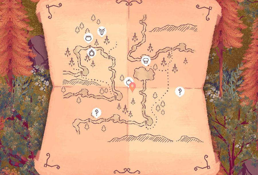
There will be some metric that calculates whether or not the character appears on the map, and whether the character is identified (just a question mark rather than the character’s icon). This is something I’ll have to figure out when balancing.
The main motive for the map was asking – ‘is running around looking for a character fun?’, to which the answer is ’to a point’. The trouble is, most characters are moving targets, giving them the potential of being very difficult to find. It’s not worth the frustration.
Another ‘map’ in the game is the Star Map. A few tweaks in the way stars work in the engine has made it much easier for me to begin plotting out where each star is placed in the sky. This is important, because constellations need to both look at least a little bit like what they’re meant to represent, and be made up of balanced stars that are appropriately hard to obtain against the reward of the constellation.
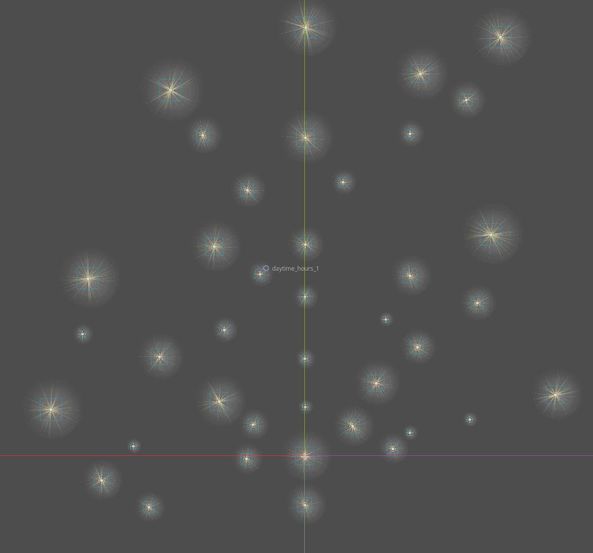
This will likely be near-endless trial and error, but I’m glad to have a system now to very quickly see which stars are which, and quickly move them around, without breaking the game.
Most of my time this last week was rebuilding how items work in the game. Before, item slots could theoretically contain any data, and all the data from the global data sheet was copied over to the slots and periodically updated. This is a little sloppy, because there’s a lot of opportunities for data to get confused in the transfer.
Instead, I made items their own Object in Godot. This means an item isn’t just a hodgepodge of data in a list, but an actual thing the game recognizes. Think of it like a bundle with all the correct information in the right place – instead of transferring lots of loose paperwork, now it’s all in a neatly organized folder with a bow on top, so to speak. Everything also now refers back to the global data sheet, instead of copying data across, so there’s only ever one point of reference.
I likely wouldn’t have gone to the effort, only it became increasingly clear that items weren’t modular enough for the systems I had planned on introducing. Previously, the only actual unique data an item would have is it’s name, and it’s quantity. Now, each item has it’s own unique ID, and can hold a plethora of optional information – age, quality, effects, and so on. This will be crucial as I flesh out the tea brewing system, which dynamically creates new teas (instead of reaching into a database of predetermined items), and a grade system, allowing players to grow more valuable versions of the plants they’re already familiar with.
While not visible yet, items are also now capable of becoming a stack – it’s own self contained inventory within an inventory. This means players can choose a specific item with a quality grade (for instance) within a stack, without it clogging up their inventory space.
Lastly, a quick sneak peak at a new animal traveler, as the cat was somewhat let out the bag in my last post – Chashka, the sika deer. Functionally, Chashka acts as the wildcard tradesperson going by the rule: if any of the other travellers wouldn’t sell, Chashka will.
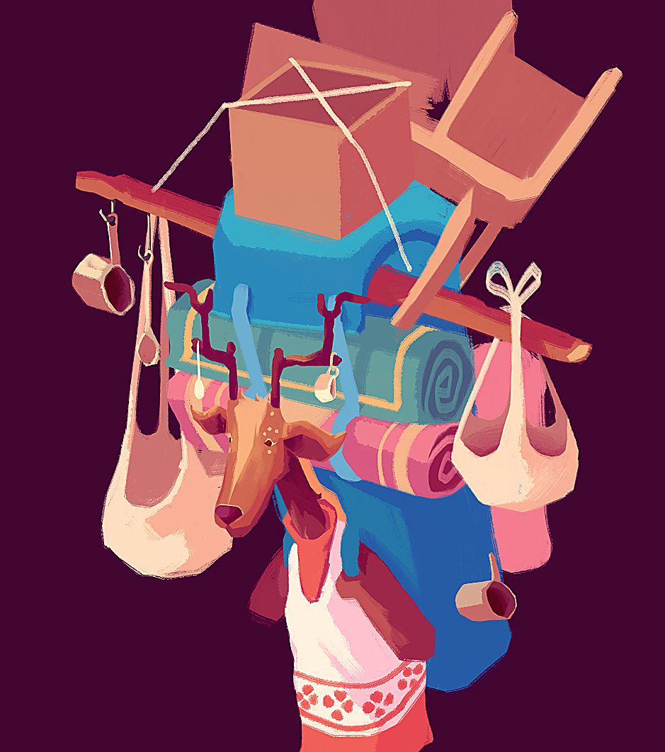
Chashka’s art will take a while as I’m keen to fill up her artwork with odds and edds to really reflect her purpose in the game.
She’s a fun character to write, and I’m looking forward to having the full animation and artwork fleshed out in the game’s world.
Follow me on Twitter, or maybe even Mastodon.
>> Link to post.Thursday Report: End Game
It was great seeing a small ignition of interest in The Garden Path with the release of the teaser trailer a couple of weeks go. I was contacted by a YouTube channel to supply some footage of the game, and so was under pressure to cook up some footage that best represents the game as it is now.
A good few days of crunch involved mostly taking artwork from Krita and getting it into the game as usable assets to demonstrate as much content as possible. Crazy to think how much the game has visually changed even since the showreel back in April – finally seeing all the new artwork in place was a huge morale boost. I think the game is settling into a style that I’m feeling more confident with working in each day, and has everything feeling cohesive. It was great actually having the flora artwork to fill in scenes to create thick forestry, and get a feel for how the game might feel when closer to release.
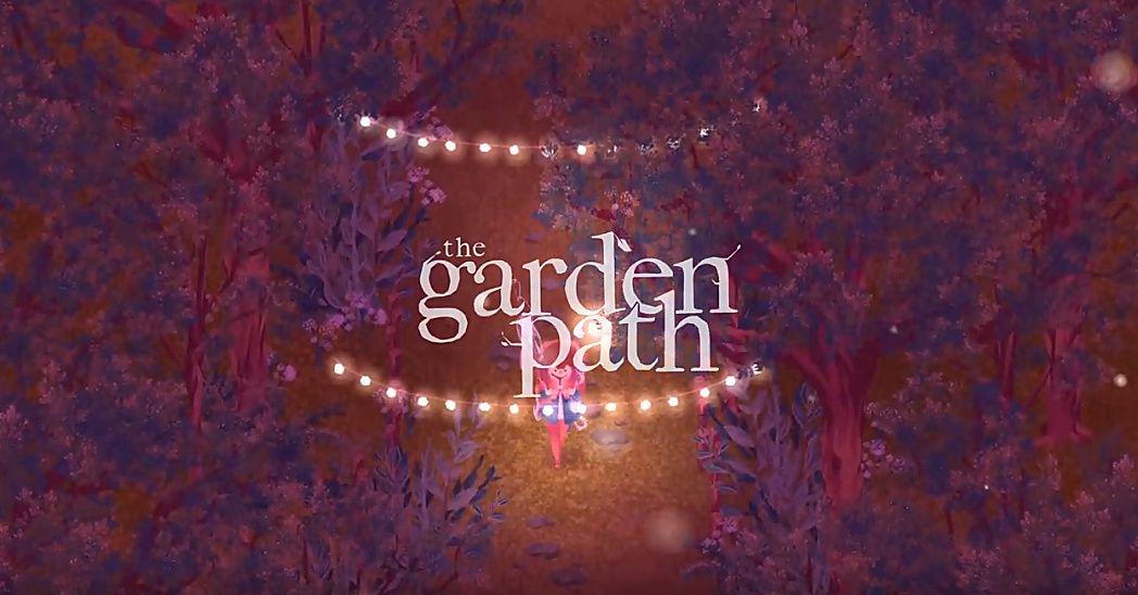
The 2 minutes was a good amount of time too, offering far more breathing room than the 15 seconds of the Godot showreel (often cut down to 10). I was worried I wouldn’t have enough content to fill the 2 minutes, but I soon found myself in surplus, having to utilize a single scene to demonstrate an animated character, the inventory, fishing, weather effects, and so on.
The teaser itself got a healthy amount of attention and resulted in some really positive feedback, hopefully resulting in at least a few more people excited for the game.
I’ve since been on break, but returned with that boost behind me and a fresh head to get stuck back in. I’ve been channeling my work time toward less broadstroke design, and more-so the finer details of gameplay that hopefully keep the game fun to play and feel good to play.
The first I’ve introduced is a new indicator when trading to give the player a ballpark of how well received a trade might be. This means crunching the numbers in realtime, hopefully reducing some of the mystique of the system and reducing some of the downtime. Previously, if the trade was bad, the player would have to sit through some dialogue before trying again. I came to realize this is mostly just needless time-gating.
It also helps gamify the experience of trading. Rather than just shooting in the dark, the player can experiment with adding and removing certain items to get the best trade possible. I want it to actually feel good when the slider moves up, especially when an item of considerably value makes the slider rocket upward.
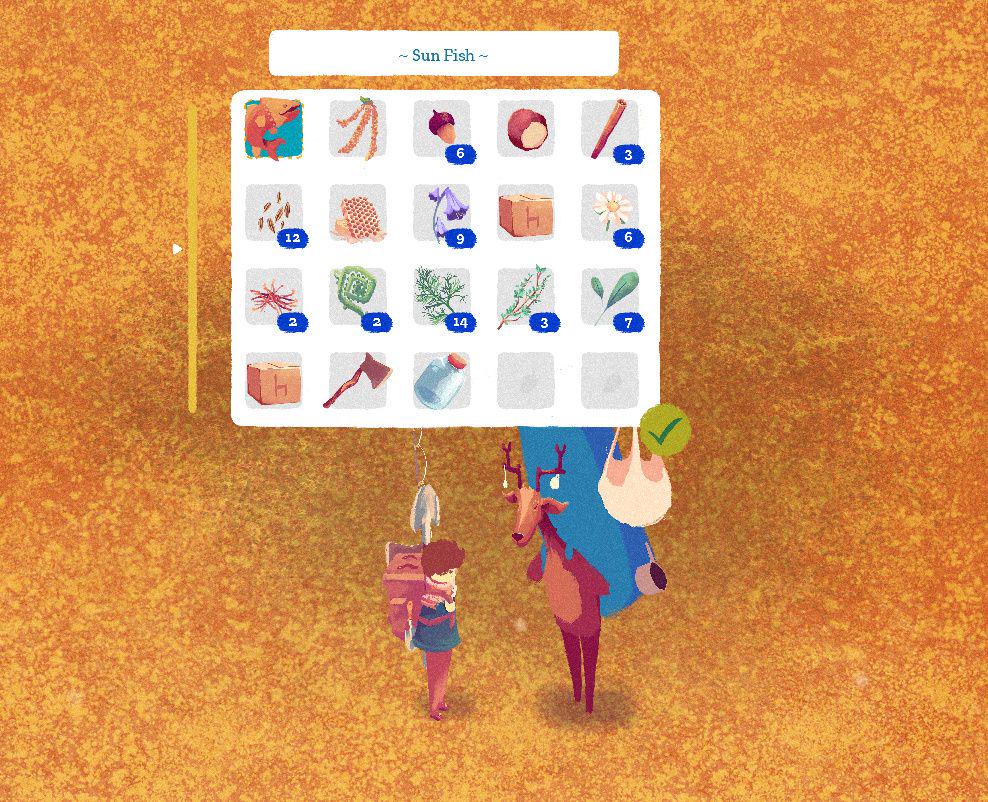
I think the key here is to make it a fuzzy unit of measurement. By simply telling the player the exact outcome of success before they attempt a trade makes might reduce the game world to the mechanics running beneath it. At the same time I don’t want to trick the player into thinking they have a good deal when they don’t, resulting in disappointment.
The plan is to have the slider get progressively more green, but unless the player’s deal is vastly exceeds what’s necessary, the slider will be more of a deep yellow. This is important, because the slider will only evaluate the inherent value against the characters preference, not the player’s charm level, or relationship with the character, which are calculated afterward. This means there will be a degree of judgment from the player in knowing how risky a trade they can make.
This system is mainly in place to prevent a player from massively overpaying for some items without realizing, which is especially important as I start looking into considerably widening the value ranges of items as part of a move to include a form of ’end-game’ (for those who don’t know the jargon, the incentive to keep playing after experiencing all meaningful content in the game).
The current plan is to begin to introduce items and content that are likely too high for the player to afford by normal means. Instead, they will be accessed by the player obtaining rarer items that are rewarded from long term play, and long term planning from the player.
I’m hoping to introduce different events for each season in The Garden Path, but the most important will be ‘Cold’s Pass’ – the final day of the year. At this time, the player will be given an option to wipe clean some of their work in the garden, and in return will have far better soil that will yield higher grade plants.
This brings with it a new important mechanic too. As The Garden Path runs alongside real time, what if someone misses Cold’s Pass, for whatever reason, but had the intention of using it for the higher rewards? Should they miss it? It’s unreasonable to expect a game to be a person’s top priority. Since The Garden Path isn’t hard-aligned to real-time already, I’ve decided to make a game world always run up to Cold’s Pass, and then pause should the player not choose to play, or be unable to play.
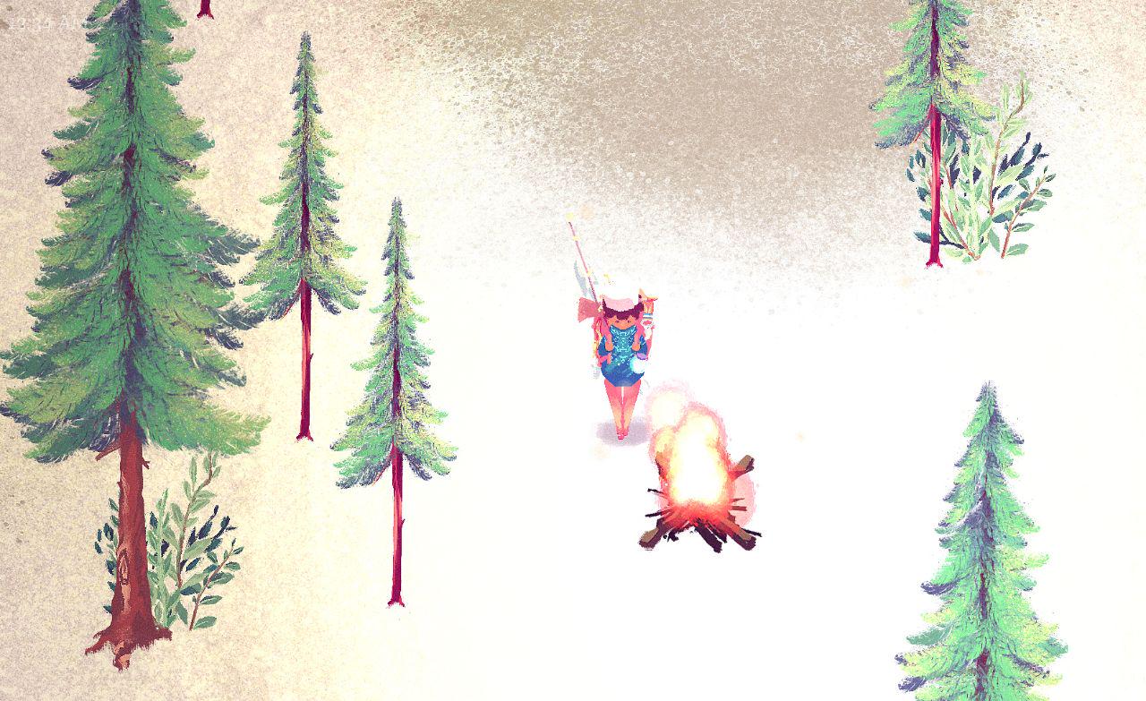
I think this is a fine balance between running the game purely at realtime, and giving the player more choice when they want to play. Hopefully, for someone who hasn’t played the game in sometime, the opportunity of a new year, with the option to start some of their garden again, will spark an excited sense of a fresh start. It should, in theory, emulate that sense of ‘seasons’ in other games-as-service games, like Path of Exile, where everyone starts from scratch again, and introduces a new sense of purpose to the game.
These features will likely be a long time in the making, as I turn my focus to getting the core gameplay feeling good and feeling meaningful.
Still, it’s important to see the woods from the trees, as it’ll help guide the smaller details toward something that feels like it function in tandem with the wider picture.
Follow me on Twitter, or maybe even Mastodon.
>> Link to post.