Thursday Report: The Garden Path in 2021
We made it to 2021! And with that the projected release year of The Garden Path.
While I didn’t reach my goal of the game being ‘playable’ before the turn of the year, I’m also much further along in ways I hadn’t anticipated.
I’m also immensely proud of the progress I made over the last 12 months. There are moments when playing the game myself that fill me with a deep joy for how close the game is to what I had envisioned all those years back.
Ambitions for the game have both grown, but also remained on a steady and manageable road. What was originally a game really about running around talking to NPCs and moving around outdoor furniture, now has what I believe to be some mature and defining mechanics – dustflies, song-fish, constellations, and a more in-depth gardening system to name a prominent few.
The rewiring of the game’s action system and ui system in the summer has really become the building blocks moving forward, allowing for new systems to be implemented so much easier, and helping futureproof the project.
For instance, while indoor-spaces were always something I envisioned really post-launch, it occurred to me I had almost everything in place to implement it within an evening. And sure enough, I was able to have the player character move in and out of a tent (teleporting the character between spaces) with just a few lines of code. I’ll be releasing more on this soon.
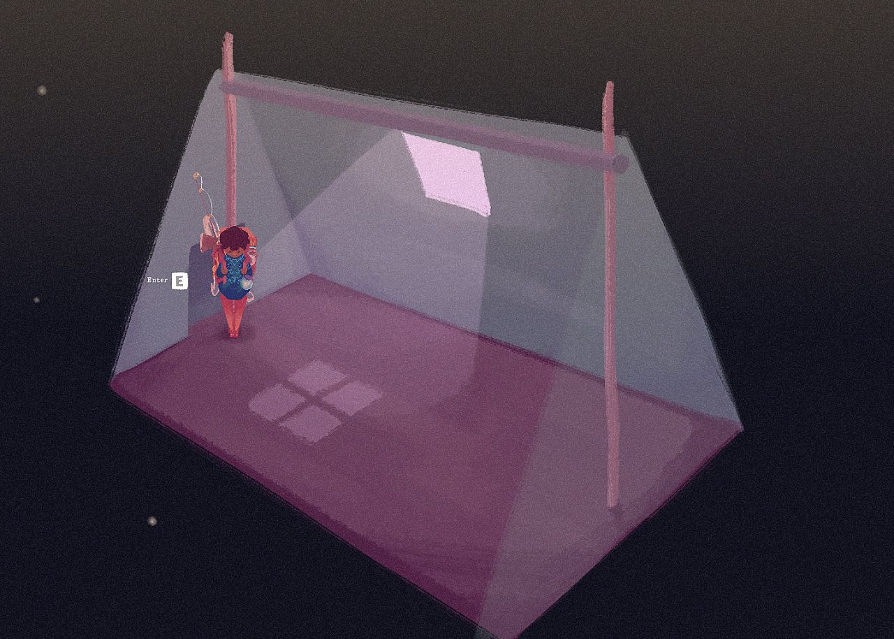
I’ll be drawing the line there! I think we have all the features we need now, and I think this final addition was the perfect icing on the cake. There is something special about being able to tuck away into your own personal abode that it felt wrong I was going to omit it. Just something simple for now – perhaps being able to unlock merchant tents in the future? Something to think about.
I’m currently caught between working on polish and playability. While there hasn’t been an announcement yet from Godot, I believe I’ve been lucky enough to secure a spot for GodotCon 2021 this year. The plan, should it go ahead, is to simply boot up the game and play from the start for 10 or so minutes. I’m hoping to strike a balance between demonstrating the game, and demonstrating the engine. There’ll be more information on this to come, but needless to say I want everything the player might experience in the first moments of the game to be as complete as possible before recording the playthrough.
Placeholder icons work great for playtesting, but for a demonstration they pretty quickly shatter the feeling of ’this is something I could play’.
With that all in mind, here’s some of the above-the-hood changes I’ve been working on, outside of artwork, animation and music…
Before, collecting from ‘flora’ props in the game didn’t feel good nor was it fun. This is something I had been struggling with since playtesting back in Spring.
There are two yielding actions in the game – with the axe and with the secateurs.
Chopping a tree feels good. There’s a weightiness to the animation, and if you aren’t able to yield an item, you can simply chop at the tree again, which is okay because it feels good to do. Secateurs collection used to follow the same principle, but it felt much worse. The player would, from standing, snip at the flora, and the game would roll if the player yields an item. This would process took about half a second. This ultimately would lead to mashing the ‘use’ button and feeling frustrated when nothing would drop.
I think the trouble is that a short animation feels inconsequential without any weight to it. Double that with the chance of failure, and the whole experience felt limp.
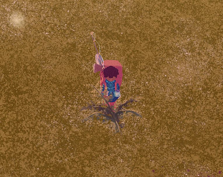
Now, the player has a much more deliberate animation. They kneel down by the plant, and do a more punchy upward cutting motion through the flora, then stand back up. There is also no longer a global yield likelihood – using the secateurs always returns a yield. In order to balance this, the item yielded is not always useful or valuable, but it’s something, and I believe part of our monkey-brain enjoys that.
I won’t pretend like the new action is fun like rollerblading is fun, but it’s a world of difference from the old player experience. I actually look forward to performing the action now, and in a game about gardening that’s a big deal.
As mentioned in my last post, creating acres for the game takes time. As such, I divided some of my time thinking of ways to fill the acres and make them feel more lively without relying on filling up the acres with unnecessary random props.
This involves rocks, inclines, dirt patches, paths and more. But I soon realized quickly I was trying to fill empty space, when it occurred to me that empty space in itself shouldn’t be seen as a bad thing. The ground texture, while nice, is flat and boring when competing with other more interesting assets.
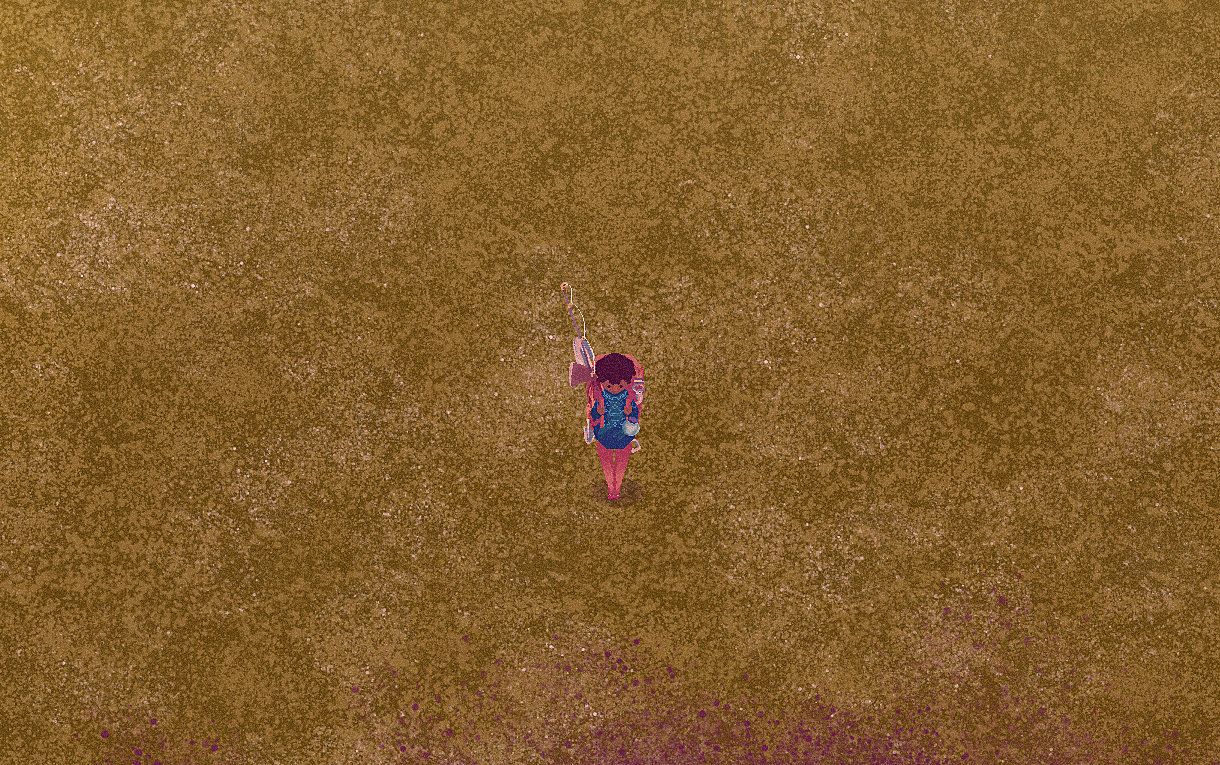
To combat this, I’ve introduced a third layer to the ground texture of more contrasting grass, made up of many separate sprites with a subtle animation. I think this goes a long way in giving a depth and motion to the underlayer of the world, and creating a small visual interest even when there’s nothing in the space. (Hard to tell in the still!)
Some work to the fishing mini-game has helped to give the player more visual and audio cues. From the playtesting players didn’t feel like the four-notes (from the four directions on the gamepad or WASD) translated well the to 2D grid. Instead, the single notes have been replaced with a fully whistled tune, and its placement on the grid now adjusts how the song is being sung – how softly, and how high pitched. This makes it more clear as to why the fish might be attracted.
The mini-game is always about striking a balance between something you can switch your brain off and enjoy, and something that rewards improvement of a skill. Before, most of the indication as to how well you were whistling was coming from the fish, but it’s both a lot of guessing work figuring out exactly how the fish is reacting while balancing your attention to the grid itself.
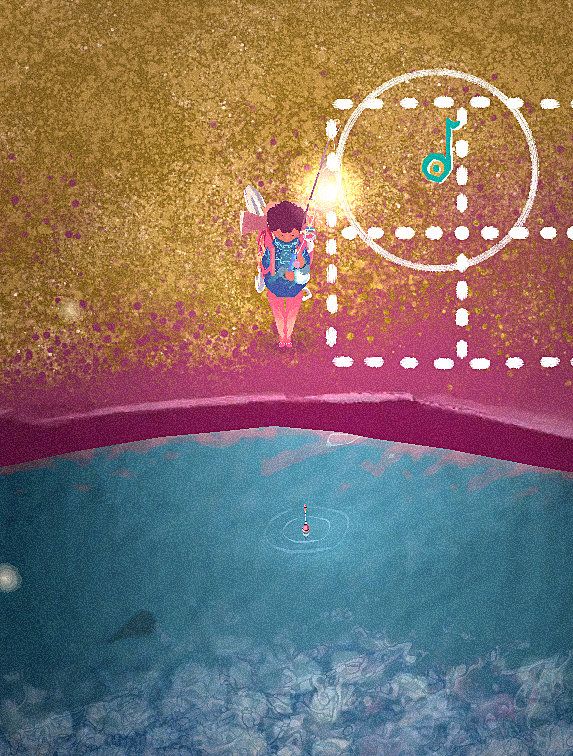
Now, once the note falls on the correct position, it will both display the area the player must maintain the note within, and also a timer to show how close they are.
As posted on social media, the player map now automatically generates itself against the world map. This sounds loftier than it is – since the world map is a series of acres places on a grid, the player map is much the same, only the acres are texture representing their world counterparts.
But this is part of a larger shift of attention toward the player map as an important utility. Before it was a bit of an after-thought, a quality-of-life inclusion that I wasn’t going to prioritise. But this feeling has since shifted as I put myself in the shoes of a new player.
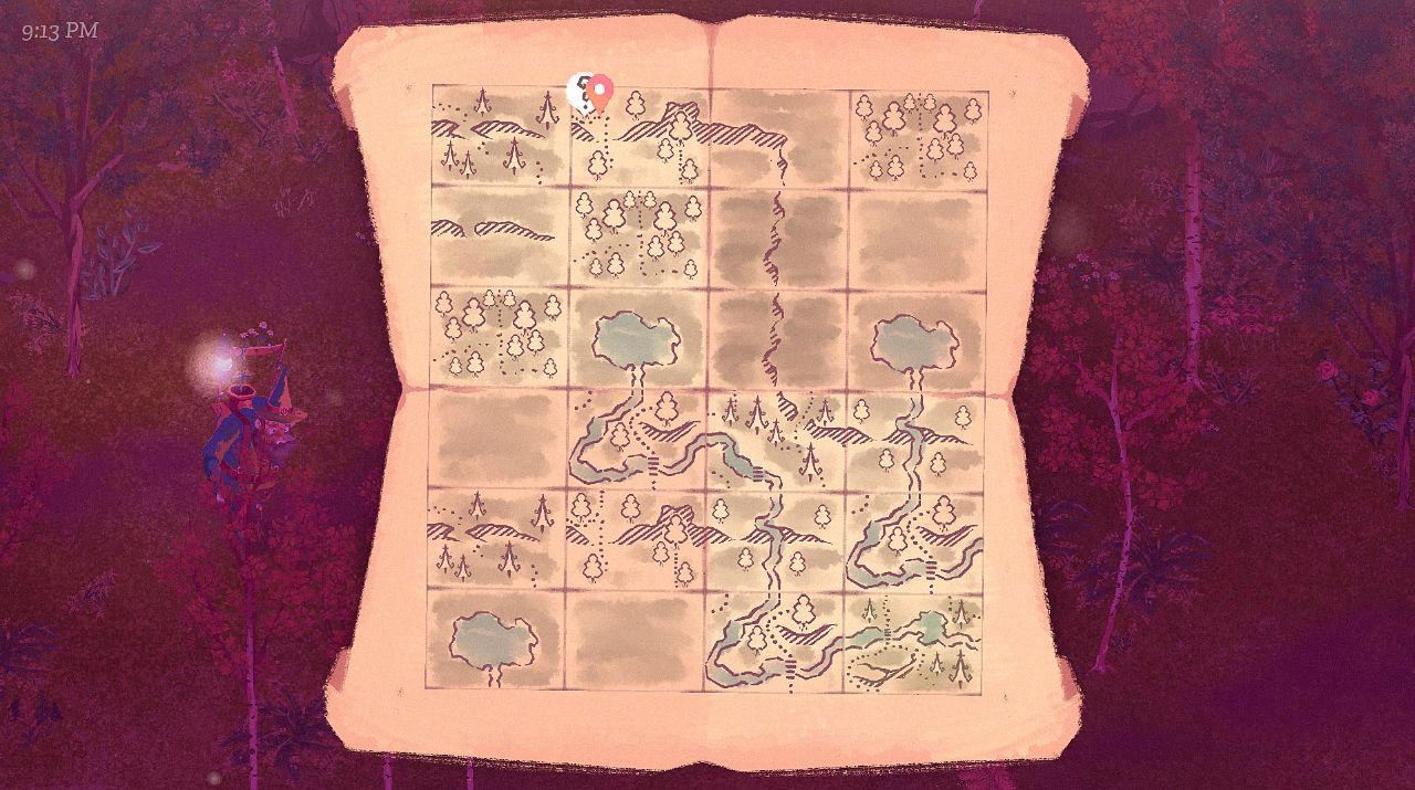
I have expanded the errand (quest) system to now recognise a wealth of different actions, whereas before they were limited to collecting certain items. With the new tutorial the player will be required to return to a number of NPCs, some of which move around the sizeable map with free-will.
The map is important to both help players track the whereabouts of themselves and NPCs, but also to alert the player that something may have changed in a certain location, urging them to go there.
This means I can avoid the alternative of boxing the player in to a portion of the map so that they aren’t overwhelmed. I toyed with the idea of locking away parts of the map – both to guide newer players and provide motive to move forward. Something about this felt wrong to me, however – I much preferred the idea that the player can explore every corner from the start, I feel like I would be gamifying the world otherwise.
The world should feel as though it’s always been there.