Thursday Report: 30 Characters
Another year, another inktober come and gone. This year I decided to aid the development of The Garden Path by illustrating a new character each day – you can read more about it in the post below. I thought I’d spend a bit of this report looking back at how things went.
Firstly, this was the first time I’d done a digital inktober. The original idea behind inktober was to get people away from computers and back to drawing on paper. Truthfully, I did miss getting the pen and ink out at the end of a day, even if I know the relief of not having to do so for another year is always an immense feeling at the end of it all.
I spend most of my day illustrating digitally, and so after finishing work it was a little bit hard to remain motivated after clocking out. Dinner, which would typically be a time to wind-down, suddenly because just another lunch break, as I’d be hitting the computer once again for another hour or so.
But ultimately once I would get started there wasn’t a character I didn’t enjoy drawing in the moment. I should stress the brevity, time spent on each of these characters probably averaged out to about an hour. As such, most I see an unfinished or at least in need of review. Any failures I had to suck up and publish anyway, because that’s the nature of the event.
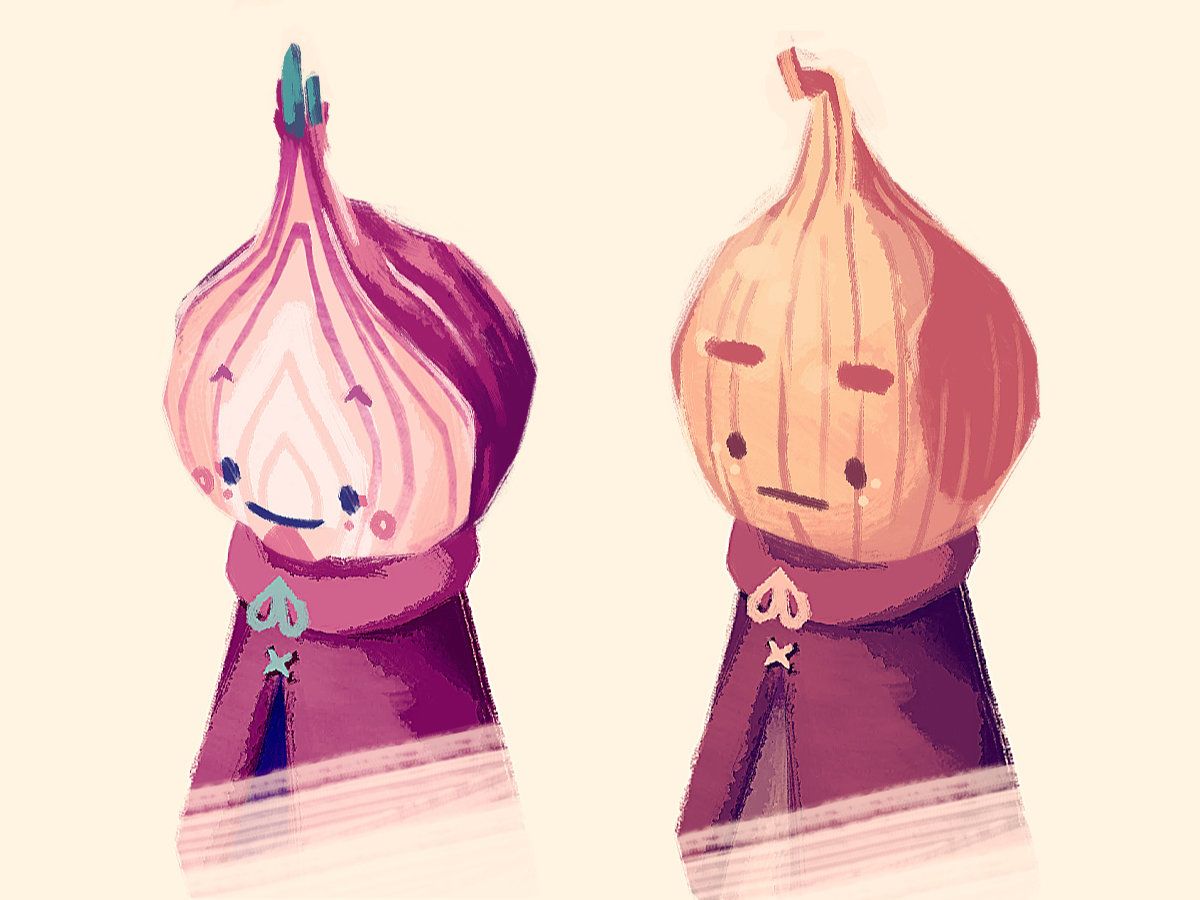
Not that there were too many failures across the board. Perhaps the best example of what I could consider a failure is Archer. I have a soft rule that if there are multiple characters of the same vegetable, I should try and choose a different variety or approach to avoid things getting samey. A good example of this would be Olga and Oliver the onions – two characters which came out really well. One is a sliced red onion, the other is a whole brown onion.

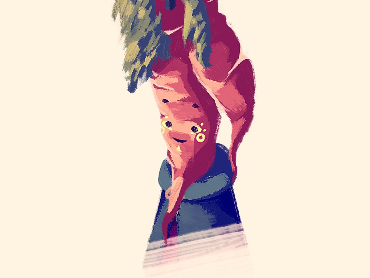
Archer was always going to be a little risky because the higher concept was to draw a non-conventional vegetable, ie. the kind of vegetables you don’t see on super market shelves. I thought ‘what if the character almost had another carrot growing off from them’.

I’m not too sure what went wrong, but it’s likely down to an imbalance of simplicity and complexity. The shape of the character is complex, but with complex rendering there was too much detail to fit in a face without the character feeling cluttered. In the end the rendering is flat (and oddly shiny) while the face is doughy and boring. I think I’m onto something with this character though, and will definitely be returning.
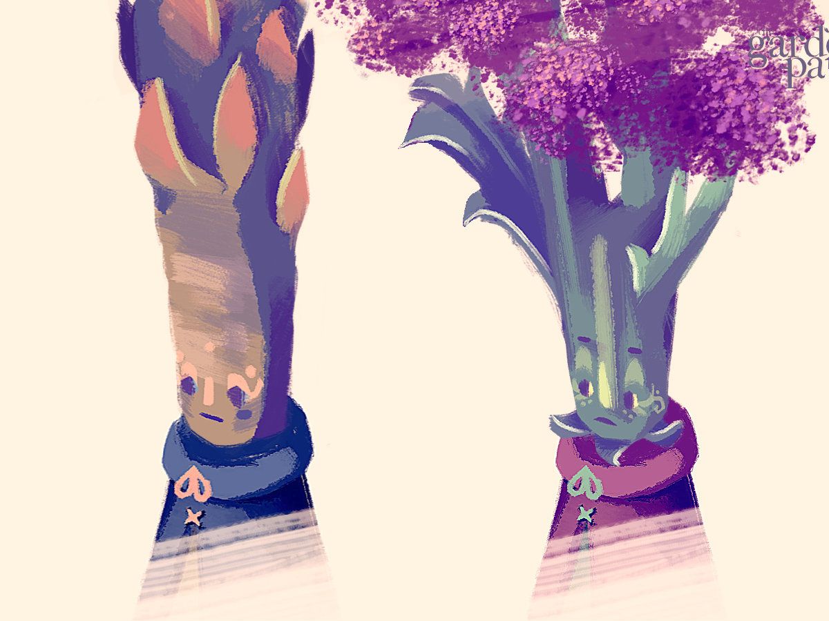
Jaime and Harriet are two characters with naturally very tall heads. I recall being very happy with each at the time of publishing, but on reflection they feel a little out of place. I’m reluctant to give all the characters ._. faces, as popular and appealing as I know they are, and on the tall character it seemed especially hard to fit that design in.

As such they’re a little bit more human-like with their noses and wide eyes. It may be difficult to read their faces in game, and I think they both need to be made more characterful in general. It may well be that the issue is their heads are far more interesting than their actual faces, and I’ll need to decide whether the aim is to out-compete, or allow the upper-details to steal the show.
In general I think a lot of the characters come off perhaps as too ‘cute’. Cute characters are often so because they are simple. That’s okay, and many of them will remain cute, but I want to make sure they all have enough depth to be three dimensional characters, rather than aspirational plush toys. The world of ‘The Garden Path’ isn’t dark by any stretch, but it isn’t designed to be purely good-vibes either. Ideally each character should have something about them that’s a little bit imperfect or unusual, something that might not be instantly appealing, but hopefully becomes an important part of how they are identified.
Development on The Garden Path has otherwise been mostly clinical. Crucially, I’ve been slowly building up a event system that allows for pre-scripted moments to occur for when they are triggered.
In a funny way, it reminds me of my time working in Visionaire Studio, where you build a game primarily using 50-or-so pre-written functions especially geared toward story-based adventure games. ‘Move character’ for example, ‘Begin cutscene’, or ‘Cue music’. I’ve been plotting out the important functions I would need, so in theory the game can just reel through all the commands from a spreadsheet, rather than from in-engine code.
It won’t be like Harvest Moon where scripted cutscenes are kicking off any-which-way, but certain key points, like starting a new game, or seeing in the new year, will need instructions.
Once that’s all in place, the game will, in theory, be functionally playable for the first time. While before the alpha was mainly testing each of the game’s mechanics in isolation, we’re on track to have a playable experience by the end of the month.
The game now performs much better (better framerate, less stuttering) with some further tweaking to how the game brings in and loads out different props, and the game also now autosaves the game periodically. In addition, it now saves when the game is closed non-forcibly (ie. Alt+F4 or clicking the X in the top right hand corner of the window.
All save data has been streamlined now to be housed in just a few dictionary containers, vastly reducing the work required swapping in and out the individual save data entries back into the game, while also offering flexibility to how much data is necessarily stored. This has made working with save files much easier.
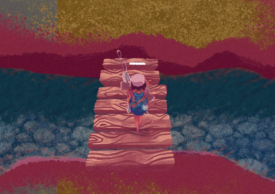
Oh, and the player’s footsteps now change noise depending on what surface they’re on.

Plenty more to share in the upcoming weeks.