Thursday Report: Mapping It Out
As most of the game mechanics are fleshed out now, we’re back to the nitty gritty rather than the theory. Here’s some of progress I’ve made over the last couple weeks.
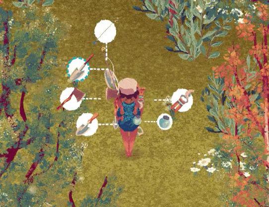
I shared on Twitter and Mastodon a little while back about the small change in the radial menu. Originally a circular menu appeared around the character allowing you to quickly select which tool you wanted to use. This bred from the idea of a menu you could pin different items to, allowing the player to choose from any item. I soon abandoned this idea, as I wanted tools to be something you actually equip to your person – ie. the tools don’t all sit in your inventory until you want to use them, they are added to your ’toolbelt’ and contribute to your stats, whether in use or not – a bit like a typical RPG.
The system was to improve on how Animal Crossing did tools, wherein you simply go to your inventory to select the tool you wish to hold. Admittedly, I winced a little when I saw in New Horizons they actually introduced a radial menu – seems we had the same solution in mind!
I had to change the design anyway, as I wanted to include an extra tool – the firefly jar. I was eager to come up with an alternate solution so it didn’t feel too similar to the system found in New Horizons while I was at it.

The new menu not only has its own identity, but better falls in-line with my UI philosophy – to tie everything to the game world. Now each circular option points to the item on the player’s backpack, rather than abstractly surrounding the player.
Originally the game’s map would be tied to this menu, but I decided an easier way about it was to tie it to its own hotkey – M or R3. This way it could be done in just one action, rather than a small handful.
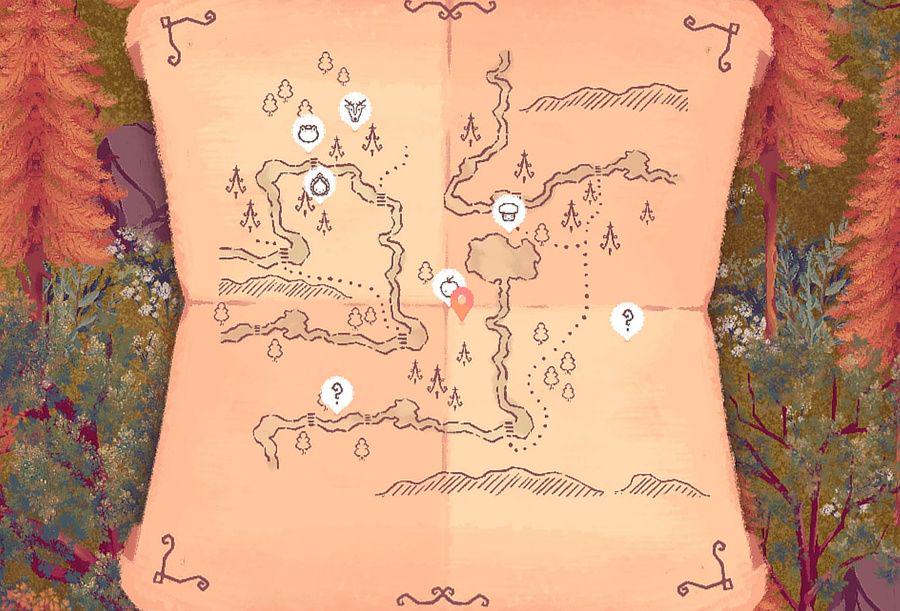
Speaking of the game’s map – the game has a map! It was a simple inclusion, as it just pings each character’s global location while the map is open and translates it to a much smaller space. The rest is simply a case of having the artwork reflect the game’s world. As the game’s map is a selection of different chunks, this is just a case of going through the motions. Unfortunately the pipe-dream of having the trees on the map reflect trees in the world is something I’ll likely not tackle, but it makes sense that the drawings wouldn’t change. The real function of the map lies in navigating around the world’s rivers, but more importantly tracking the locations of the different characters.

There will be some metric that calculates whether or not the character appears on the map, and whether the character is identified (just a question mark rather than the character’s icon). This is something I’ll have to figure out when balancing.
The main motive for the map was asking – ‘is running around looking for a character fun?’, to which the answer is ’to a point’. The trouble is, most characters are moving targets, giving them the potential of being very difficult to find. It’s not worth the frustration.
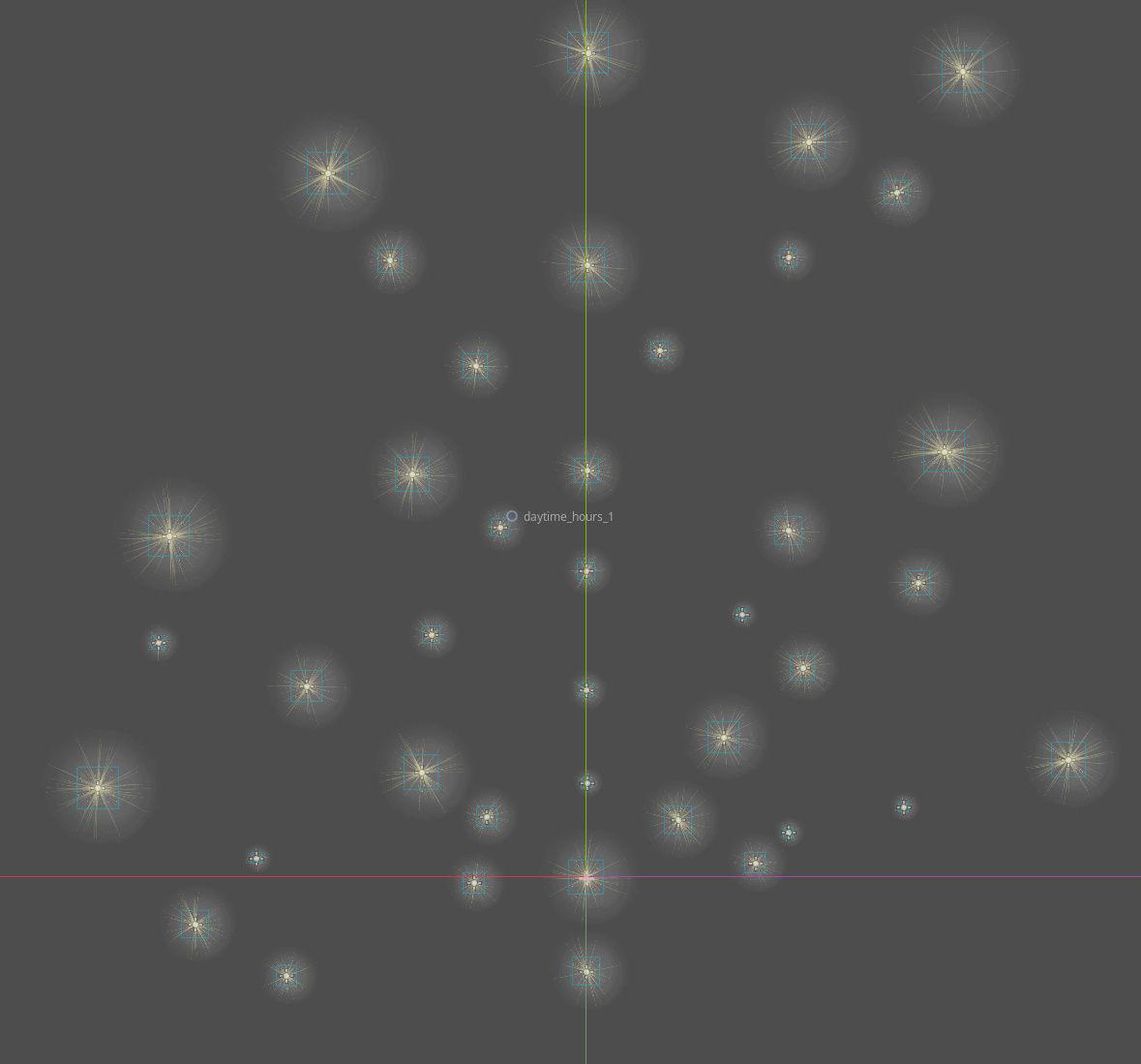
Another ‘map’ in the game is the Star Map. A few tweaks in the way stars work in the engine has made it much easier for me to begin plotting out where each star is placed in the sky. This is important, because constellations need to both look at least a little bit like what they’re meant to represent, and be made up of balanced stars that are appropriately hard to obtain against the reward of the constellation.

This will likely be near-endless trial and error, but I’m glad to have a system now to very quickly see which stars are which, and quickly move them around, without breaking the game.
Most of my time this last week was rebuilding how items work in the game. Before, item slots could theoretically contain any data, and all the data from the global data sheet was copied over to the slots and periodically updated. This is a little sloppy, because there’s a lot of opportunities for data to get confused in the transfer.
Instead, I made items their own Object in Godot. This means an item isn’t just a hodgepodge of data in a list, but an actual thing the game recognizes. Think of it like a bundle with all the correct information in the right place – instead of transferring lots of loose paperwork, now it’s all in a neatly organized folder with a bow on top, so to speak. Everything also now refers back to the global data sheet, instead of copying data across, so there’s only ever one point of reference.
I likely wouldn’t have gone to the effort, only it became increasingly clear that items weren’t modular enough for the systems I had planned on introducing. Previously, the only actual unique data an item would have is it’s name, and it’s quantity. Now, each item has it’s own unique ID, and can hold a plethora of optional information – age, quality, effects, and so on. This will be crucial as I flesh out the tea brewing system, which dynamically creates new teas (instead of reaching into a database of predetermined items), and a grade system, allowing players to grow more valuable versions of the plants they’re already familiar with.
While not visible yet, items are also now capable of becoming a stack – it’s own self contained inventory within an inventory. This means players can choose a specific item with a quality grade (for instance) within a stack, without it clogging up their inventory space.
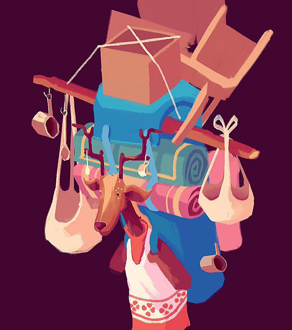
Lastly, a quick sneak peak at a new animal traveler, as the cat was somewhat let out the bag in my last post – Chashka, the sika deer. Functionally, Chashka acts as the wildcard tradesperson going by the rule: if any of the other travellers wouldn’t sell, Chashka will.

Chashka’s art will take a while as I’m keen to fill up her artwork with odds and edds to really reflect her purpose in the game.
She’s a fun character to write, and I’m looking forward to having the full animation and artwork fleshed out in the game’s world.