Thursday Report: The Race
One of the scariest aspects as an artist on large-scale projects is competing against one’s own artist capabilities. It’s a race — the longer a project takes, the better an artist you’ll probably be by the finish line. That is, of course, if you are practicing and creating and improving in the meantime (which during a project, you almost certainly are).
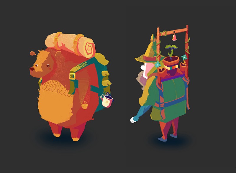
I have no idea if this is avoidable. A year ago I released ‘Crossing to the Cold Valley’ — a project which I had initially created entirely in about 21 days as a university project back in spring 2016. It was the first time I had really committed to environmental illustrations; I adopted a quick brush-stroke style that seem to generate backgrounds very quickly, and I remember being very happy with how they looked.
When deciding to release the game to the public a year later, the job was simple, I had to upscale all the 720p artwork (I have no idea why I built the game in 720p) to be 1080p and call it a day. I soon realized I would need to touch up areas with the brush tool, and after just a few minutes on my first image I realized: ‘Oh, I’m better at this now’.
Suddenly I knew in my gut that a week’s work was actually going to take me until Christmas.
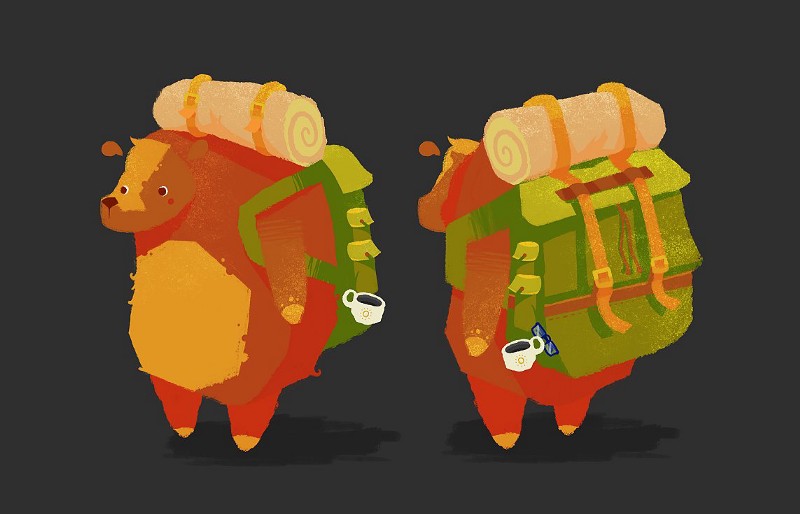
2016 v. 2017
Over those months, something even worse happened — the last improved illustrations were looking much stronger than my first attempts. All of a sudden, I wasn’t correcting 2016-me, I was correcting 4-weeks-ago-me. That’s even more work to tackle.
‘Half of art is knowing when to stop’ — just about everyone is quoted as saying something along these lines online, but that’s probably because it rings true. The answer is, of course, to set a deadline and stick to it. While we can look back as single pieces as relics of a past, old artwork for a larger project, while ‘finished’ is part of a much bigger piece that isn’t. The challenge is a compromise.
I’m guilty of being human: social media has been invaluable in sharing with me inspirational artworks that teach and guide what I do, but I do get jealous. Not necessarily jealous of someone’s ability, but more often a stylistic decision they’ve made in a project that looks stunning. I often find myself thinking ‘What if my game looked like that?’.
And it’s liberating to know that I’ve made things aren’t yet set in stone, the style of the game could change. That said, it’s important to remind myself to see value in my own style and my own perspective. Always bring yourself to something if you can.
So, I’ll go back to some placeholder artwork and improve on it. I pushed out a large amount of art, before and during the summer this year, because it’s an easy way to build engagement, and it’s something I know I can do already. And sure, it’s nice to take a break from coding and development, but I do run the risk of pushing out artwork that will only need to be replaced a month or two down the line as my understanding of lighting, shading, shapes and colour change.
That said, practice is practice, and there’s no shame in wanting a project to look as good as it can be. Right now I’m going to be slowing down on artwork, so that as the game mechanics develop I’ll have (hopefully) grown into a stronger artist from my other illustration experience over time.
I’m always flattered whenever anyone comments kindly on the look of the game, because, for the most part, the sprites themselves are very rough still. But so much more than the raw artwork contributes to the look of a game. It’s important to experiment in taking those rough sprites as far they can go, so that when more refined sprites come through, it’s the full package.
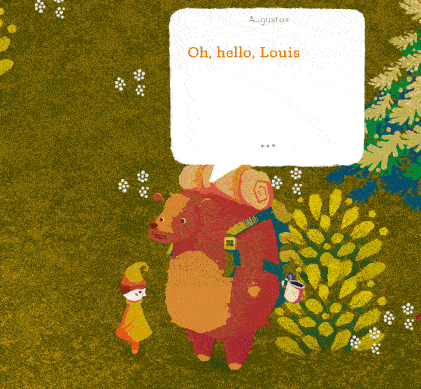
I added subtle eye movements to Augustus, and it contributes a great deal of life and character to the game experience. Suddenly you read more into his character, he seems more anxious and observational, rather than having his eyes focused dead on a single, dull point. It’s a simple loop, but it goes a long way.
In a similar vein, I had a request a couple weeks ago to talk about my dynamic shadows, and felt it made sense since it’s a feature that’s often commented on across social media. Truth is, it’s built right into Godot, and requires very little work to get working, but it certainly gives the characters a sense of weight and place.
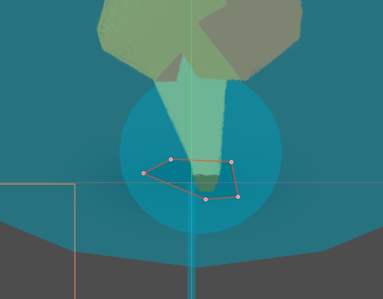
Godot has a ‘Light2D’ node as-standard. This is essentially a bunch of preset features for how the game should treat a certain texture.
The texture itself is just a radial gradient, with a bright yellow tone in the center, fading out gradually to full transparency.
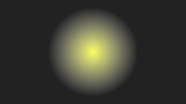
Godot then runs this as the blend mode ‘Add’. Blend modes, for anyone that doesn’t know, are fairly standardized across many pieces of software dealing with visuals. The gist is that it decides how a layer visually effects the layer beneath it. ‘Add’ lightens the layer beneath it according to the brightness of the layer above it — so with the texture above, the center would be lighter than it’s surroundings, gradually fading away from the center. That’s exactly how a light should be.
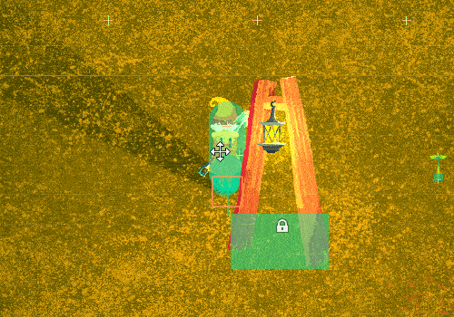
Godot also has a ‘LightOcculder2D’ node. This is a two-dimensional polygon that, as the light emits and hits it, will remove the light texture in that direction to create the illusion of a shadow.
It’s essentially an invisible opaque wall, but it should be drawn to reflect the character that is drawing the shadow. Larger characters would have larger light occluders, for example.
And you’re ready to go. You toggle shadows and so long as the light occluder is within the light texture, it will draw a shadow. The shadow will continue until it reaches the end of the light texture.
I would love to have a global lighting system, for sunlight or moonlight, but this isn’t currently so easy in Godot. The Light2D shadows rely on the shadow extending as far as the light itself . The sun lasts as far as the horizon, so it would need additional data to figure out how long to cast the shadow for. One trick is to make an absolutely huge Light2D that covers the entire game, but this is pretty taxing and unpredictable. I’m still looking for other solutions. I would love to convey light breaking through foliage somehow.
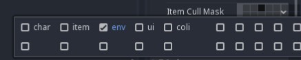
The last thing I will mention is ‘Item Cull Mask’. In Godot, you assign each node to a different, labeled layer. This helps the engine, but also me, to know what’s the ground, what’s the interface, what’s an NPC and so on. By ticking on only ‘env’, it means the shadow only casts itself along the ground, and not through items or characters, resulting in things looking unintentionally translucent.
I’m hoping to focus myself and make strides in the game’s mechanics themselves as top priority over the weeks leading up to Christmas.
I’ll be sharing as much as I can on the development along the way.
Follow me on Twitter.